From Lattice Braids to Just-Pinched Cheeks: A Master Class in Wuthering Heights Beauty, Straight From the Lead MUA
Emerald Fennell's newest film offers a dreamy, modern take on Victorian aesthetics.
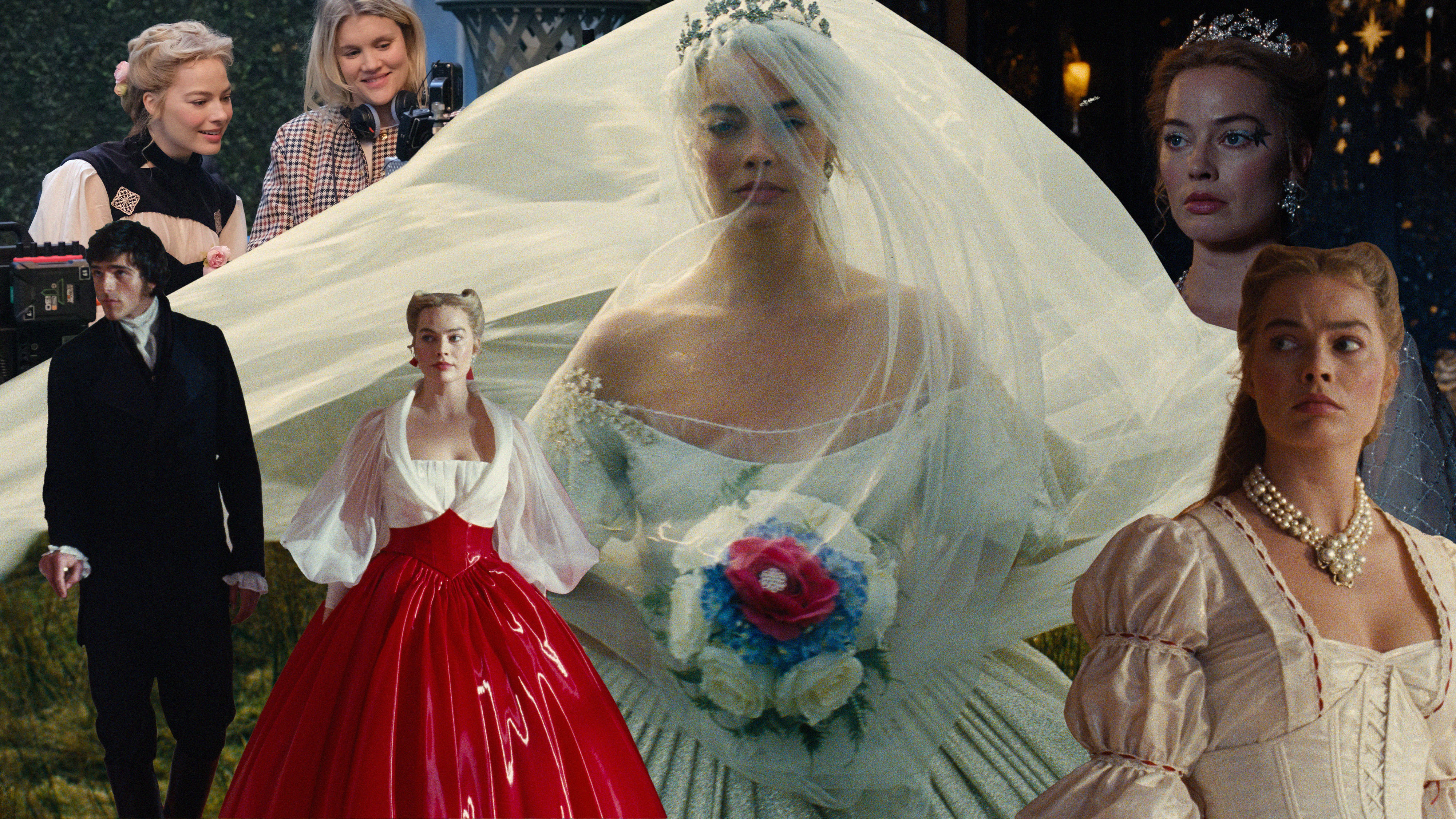
There's nothing traditional about filmmaker Emerald Fennell's recent take on Wuthering Heights, the twisted, dark romance authored by Emily Brontë in 1847. The end result? Endless possibilities for the film's award-winning hair and makeup designer, Siân Miller, to translate the heartbreaking tale of two haunted lovers from the windy moors and the film's titular mansion, a feverish, dreamy world fueled by nostalgia and desire. Tear-stained cheeks, muddied hems, and corsets undone by frantic hands come to mind when I envision the most memorable love stories of the 19th century, but this bold take on the tale will leave audiences exposed to much more with captivating beauty.
Among the sprawling Yorkshire moors of Victorian England, we're introduced to Wuthering Heights: a dark and brooding home with halls plagued by the secrets and desires of its occupants... and perhaps a ghost or two. While the film's costumes are already stirring buzz among fashion lovers and moviegoers, it's the beauty that intrigues me the most. To learn more about the thought process behind the dark romance's makeup and hairstyles worn by its star-studded cast, I reached out to Miller for all the nitty-gritty beauty details that set this adaption of Wuthering Heights apart from all others.
The film, starring Margot Robbie as Catherine Earnshaw opposite Jacob Elordi as Heathcliff, hits theaters on February 13, and I got an insider's scoop on all its best beauty moments. Below, Miller shares everything about the movie that sparked a renewed public interest in Victorian aesthetics just in time for Valentine's Day.


Creating Fever-Dream Beauty in Wuthering Heights
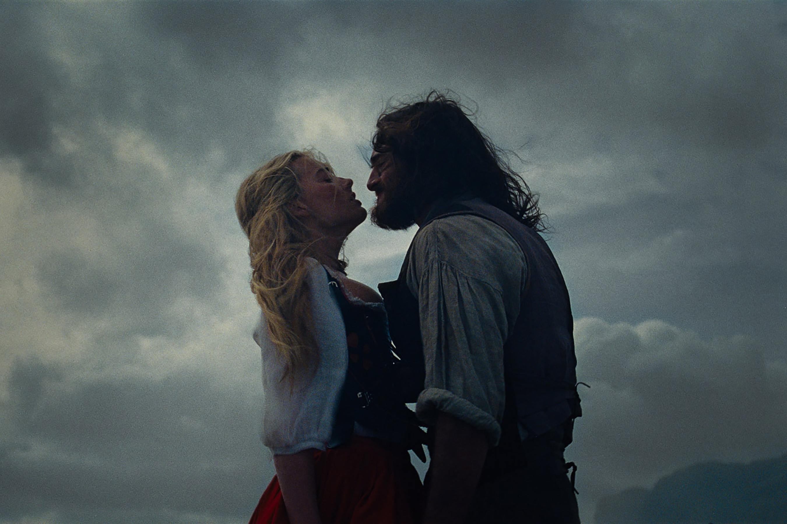
The film blends modern and classical references to create visual intrigue, and the result is decadent. How would you describe the unique beauty aesthetic?
We started everything with Emerald's mood board, which was a combination of imagery from the fine arts, architecture, movies, fashion, and the great outdoors. Then, using a private Pinterest group, I would periodically meet with Emerald, production designer Suzie Davies, and costume designer Jacqueline Durran—all of whom I've worked with before. I looked at what they were doing with the tones and color palettes and knew the film needed to be a fever dream through the imagination of a 14-year-old girl—just as Emerald was when she read the book.
Wuthering Heights is a stylized vision with a contemporary take on a mid-century, Old Hollywood soundstage melodrama that draws from a broad elements. It was a smorgasbord of visual references brought together. I liken both of the films I've done with Emerald to learning a language. Both languages are similar, but this is slightly different. Once I've learned the language and I'm in the world, instinct takes over. As my team came on board, it was really a case of trying to get that shared understanding.
How does your creative process for period dramas differ? What sources did you refer to for inspiration?
The film definitely has a tone of a Hollywood melodrama and manages to re-create that feeling. It was a combination of the cinematography, the lighting, production, design, costume, hair, and makeup. … It just has that feeling about it. Jacqueline was my closest ally in terms of the collaboration alongside Emerald, and they were my guiding lights. Early on, Emerald laid this story out in three acts, but it wasn't pinned out and precise. We played around with a lot of ideas and changed things as we went.
Once we knew the motifs and that they were going to suit Margot, so many of the aesthetic choices then became about the necklines, hair, and silhouettes. When it came to the jewelry, I remember constantly wondering what I could do to it that wouldn't ruin archive and designer pieces to turn them into something for the hair in an unexpected way! It was a constant dialogue between the team.
Color plays a massive role in Wuthering Heights to illustrate everything from moments of heartbreaking passion to picturesque dreamscapes. Can you tells me about Catherine's beauty color palette?
The only colors Catherine wears are black, white, and red. One of the dresses you would have seen photographed when she's wearing what Emerald and I call "the horns," which are likened to victory rolls, and a black dress that almost looks like a midnight blue. Throughout the Wuthering Heights set, you can see some leaded windows with an odd palette of red in there and black-and-white floors, so there are echoes of that palette in the product design as well.
In terms of the color palette with the skin, we wanted to start out with Cathy as a child living in a house that's quite isolated in the moors. Her skin is exposed to the climate, and there are freckles and a windburn kind of look. I had scans made of both the younger Cathy (Charlotte Mellington) and Margot, which were turned into 3D vacuum forms. We drew freckles on both performers, translated them to the 3D prints, hot-knived through them, and mixed up a bespoke freckle tone that could then be airbrushed on for continuity.
We see a flush on Heathcliff, Cathy, and Nelly as children that, as they become older, transforms into a natural flush in a deeper tone. It was all about what suits them and looks natural. When we get to the Grange in the film, we used blush not just for cosmetic purposes but as a tool for displaying emotions, like exasperation, nerves, arousal, and anxiety. It helped performers create their characters and tell the story in a subliminal way that can be woven through the narrative. For the rest of it, the goal was to have the look of nude skin.
Catherine's character undergoes notable personality changes as she matures and her relationship with Heathcliff evolves. How is this reflected in her hair?
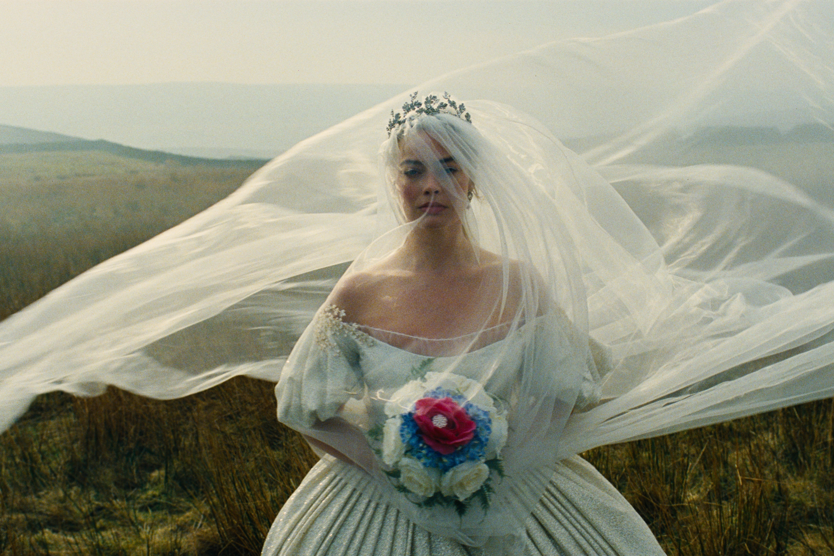
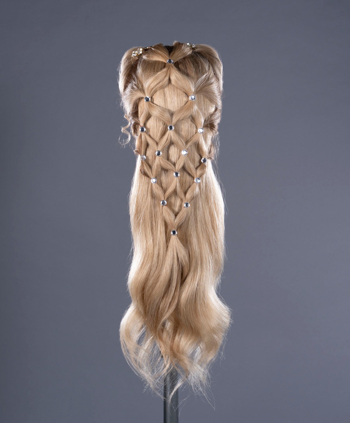
Initially, we wanted Cathy to have a windblown, natural short of mess that's raw and real. Then, she goes to the Grange and is transformed. For this scene, we wanted an updo created by Isabella. For a time, Cathy reverts back to a "business as usual" Wuthering Heights look, but after she returns to the Grange, we see her wedding style. Emerald had an image on her mood board of a chained diamond over the top of her hair kind of like a cage, which is symbolic of this chapter for Cathy. We decided to create that with hair as a decorative lattice design and little diamond jewels to be seen through the veil.
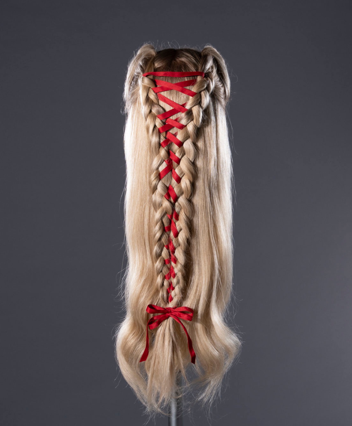
Could you break down some more of the hair looks we'll see in the film? How did braids with ribbon and jewel detailing come to mind when establishing a look for Catherine?
The pivotal moment when we start to see the narrative of hairstyles is when Cathy is shown the new life Isabella has made for her. Isabella introduces Cathy to the collection of dolls that she's braided and plaited the hair of. We see her in a doll braid or lattice plait, and Isabella opens up a dollhouse. Isabella has designed and created this world where she can dress Cathy up just how she treats her dolls that look just like Cathy. The way the dollhouse scene is filmed is amazing!
I also spotted jewels on her skin to create the look of teardrops or silver leaves in the promotional imagery. Why were you drawn to these delicate details?
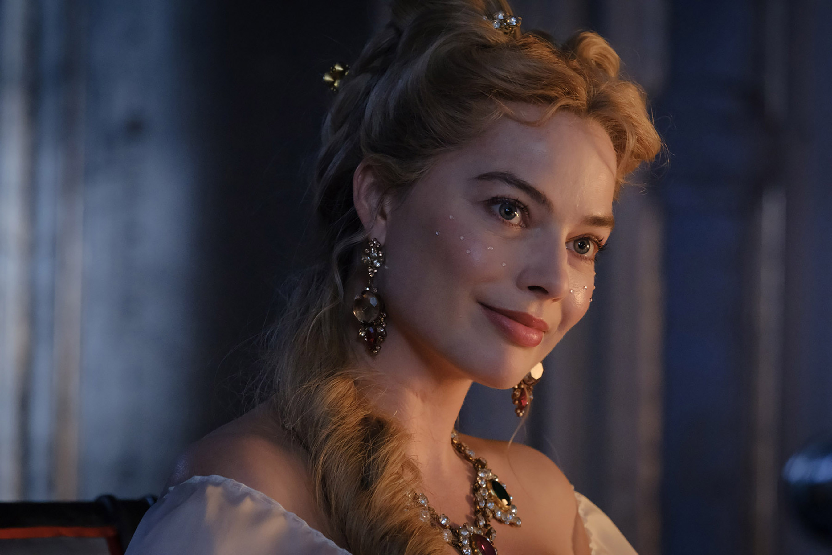
All the skin ornamentations stem from references on Emerald's mood board. It had Galliano and Pat McGrath 2007 as well as Vivienne Westwood's 2009 fall/winter campaign where there's silver leaf and silver lashes. Pinterest was fantastic for all this, and we had a plethora of images that we all added to. We didn't know when to use the looks and how wanted to go about it until we got Margot in the chair, but Emerald knew that she wanted to use makeup as a vehicle to show the passage of time in montages.
The jewels on the face were inspired by walls in the [Wuthering Heights] dining room from production design. In the early stages of the set, the walls were silver and decorated with ornate silver jewels with a hemispherical kind of effect. We wanted to echo it in makeup and found some online to use on Margot. Emerald is such a great visionary and has great ideas to feed from. We took a very organic approach that helped the narrative move along.
What can you tell me about the beauty approach you took for the other female characters in the film—namely Isabella and Nelly?
It was kind of a case of "We'll do what suits!" We knew that with Hong Chau and Vy Nguyen (playing the older and younger versions of Nelly) that Nelly is poised and minimal, so we kept the makeup quite contained. She's essentially a servant, and that is made cruelly clear to her. Nelly has a more Victorian style that doesn't change until the end.
For Alison [Oliver] as Isabella, it was all about the fabulous head of hair! She has a girly, doll-like look using headdresses with ribbons and bows and a pale-pink blush on her cheeks that shows she's quite young for her age. There has not been an awakening yet. There's such a great contrast between Nelly, Isabella, and Catherine that is so interesting.
What were your go-to products on set to create these memorable movie looks?
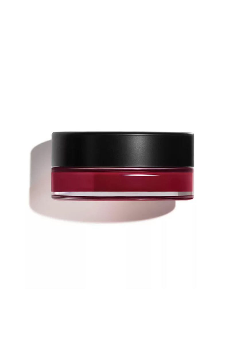
There's a product that's not so readily available, Le Maquillage Professionnel's Fard Crème. I love [it] because it's made from natural waxes and is really sheer on the skin. For blush, the one that worked well for the cast was the N°1 de Chanel Cheek and Lip Balm in Berry Boost, which is also what Pati Dubroff is using on Margot for the press tour.
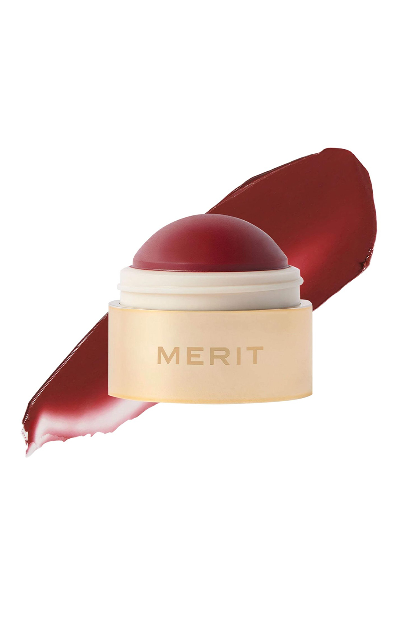
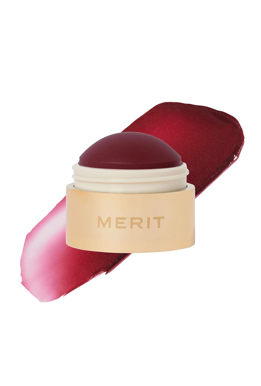
Equally, I liked Merit's Flush Balm and ones from Rare Beauty and Pixi Beauty. So much of the looks for Cathy's exasperated moments were all her! The natural-looking makeup didn't create masks on anyone and worked hand in hand with the actors' skin to help harness emotions.
Discover Wuthering Heights Beauty Essentials

Maya Thomas is an Associate Beauty Editor at Who What Wear. Her strong love for all things beauty, interior design, and fashion stems from a strong childhood interest in the fine arts. During a gap year spent in Paris studying the history of French fashion, she shifted her focus to English literature and journalism as a student at Loyola Marymount University. After graduating in May 2021, Maya began freelancing for Parade.com as a contributing commerce writer. When she's not writing, Maya spends her free time catching up on reading, perusing art galleries, and enjoying a night out at the ballet every now and then.
