8 Spring Print Trends That Will Make You Want to Break Up With Quiet Luxury
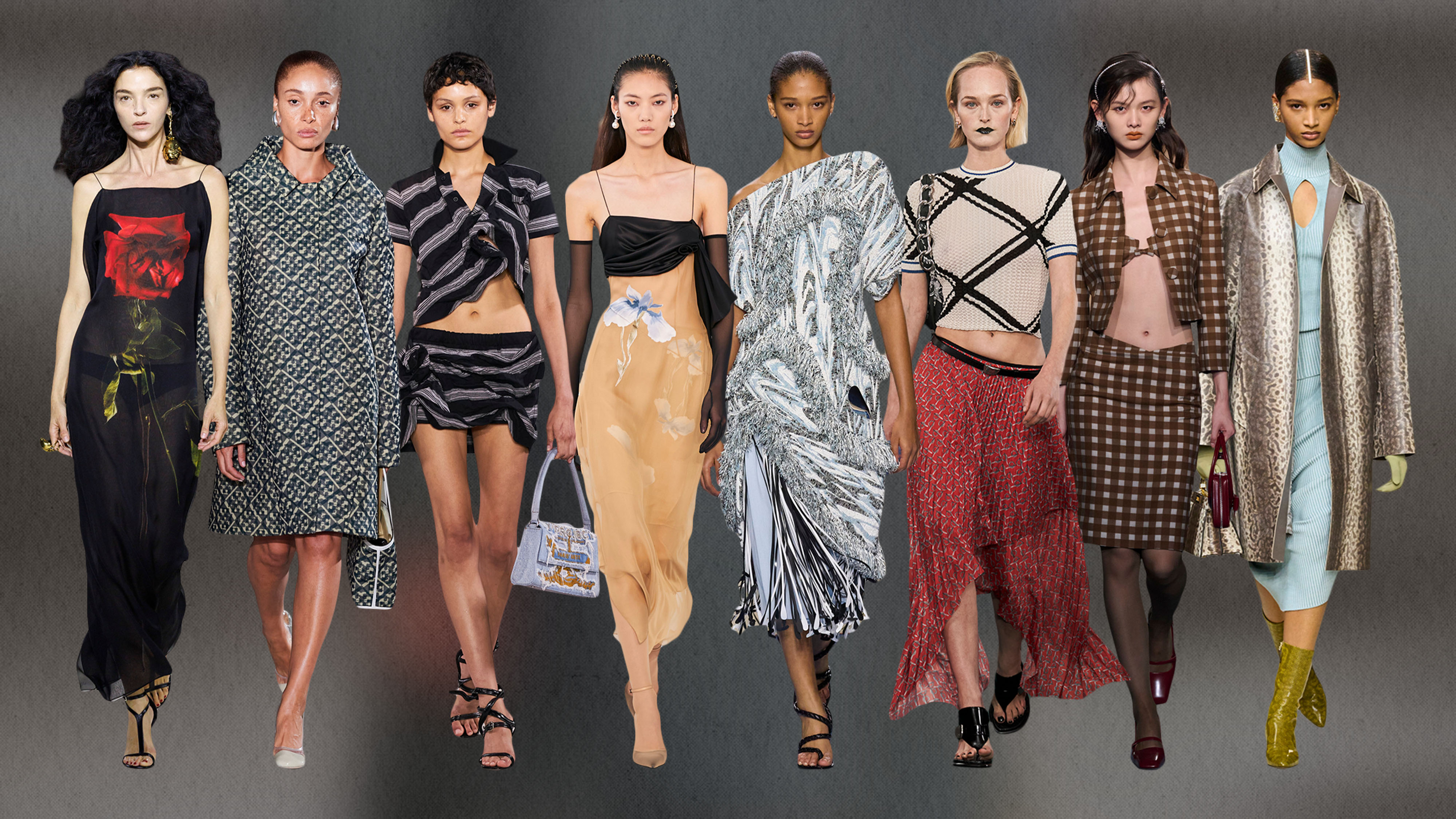
Controversial take coming for you: I'm tired of how the term "quiet luxury" has been interpreted. Don't get me wrong—the concept of investing in basics is something that I'll always endorse. But as we've witnessed the mass popularization of minimalist aesthetics in the past few seasons, it feels as if something has gone missing from the mainstream. My theory? The magic is gone. Yes, style is subjective, but what's irrefutable is that statement pieces are the spice of life. After all, anyone can own those traditional staples (e.g., classic button-downs, wide-leg trousers, or flat sandals), but few can style them in a way that feels signature to them. What's missing from the current landscape is the fact that while the quiet-luxury movement has been championed by more minimalist-leaning brands, that doesn't mean you have to approach it from that lens. It's more about approaching style with intention—finding the delicate balance between adopting bold trends and living in those "boring" but timeless things.
While everyone's approach to striking that balance with their style differs, one underrated way to do so is by wearing prints. In my humble opinion, there's no easier way to add a dash of surprise and delight than by incorporating patterns into your closet. Not only can they add visual intrigue to any ensemble, but they can also be the easiest way to make those more timeless items more trend-forward. But if you are dubious about the power of prints, keep reading. Ahead, I'm breaking down the eight biggest prints from spring/summer 2024 collections that can bring back a sense of "serendipity" into everyday staples. Whether you're a devout minimalist or maximalist, something ahead will speak to you (and it won't be quietly).
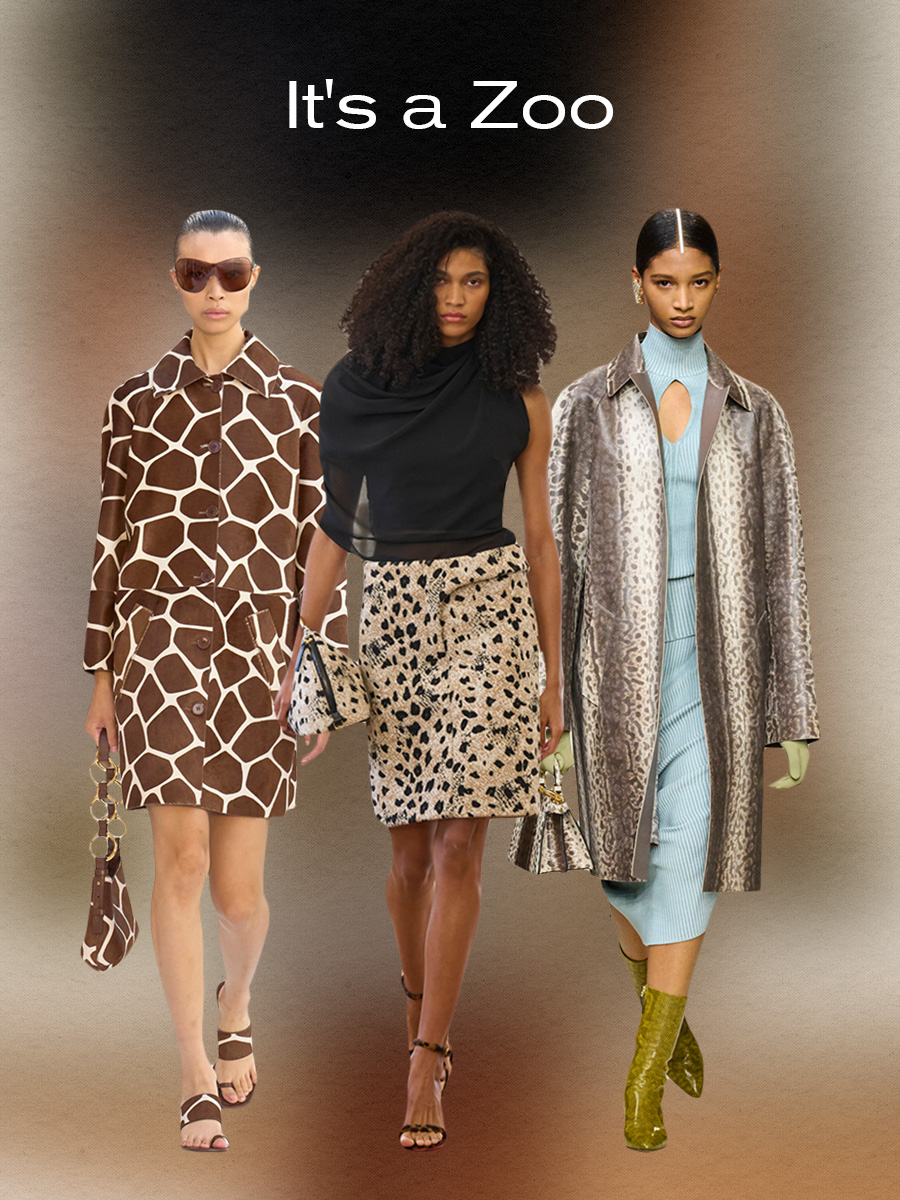
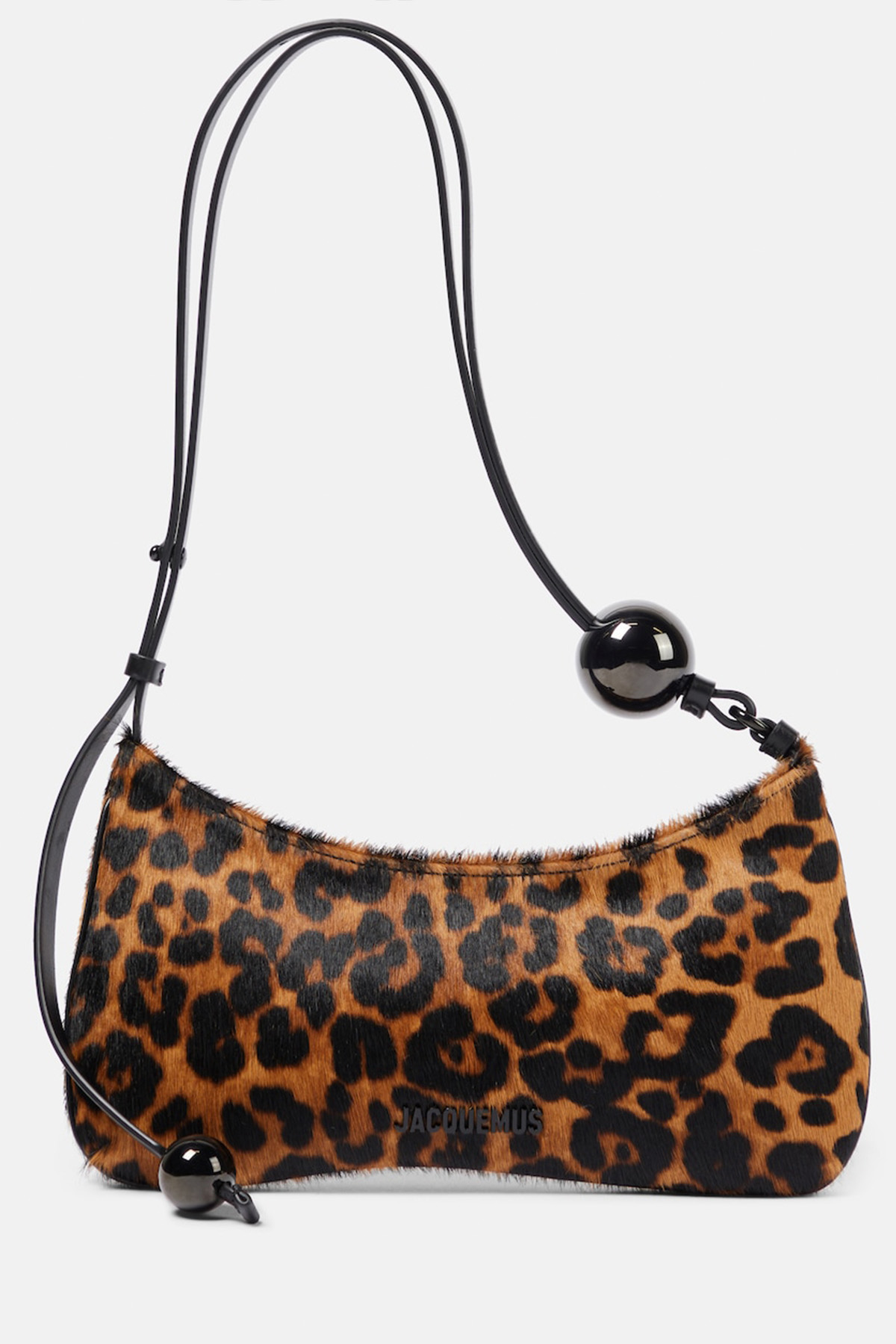
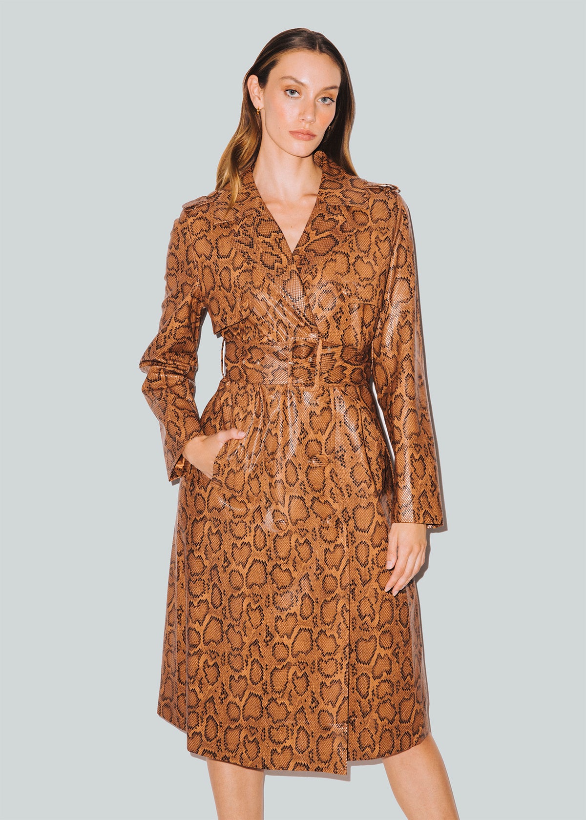
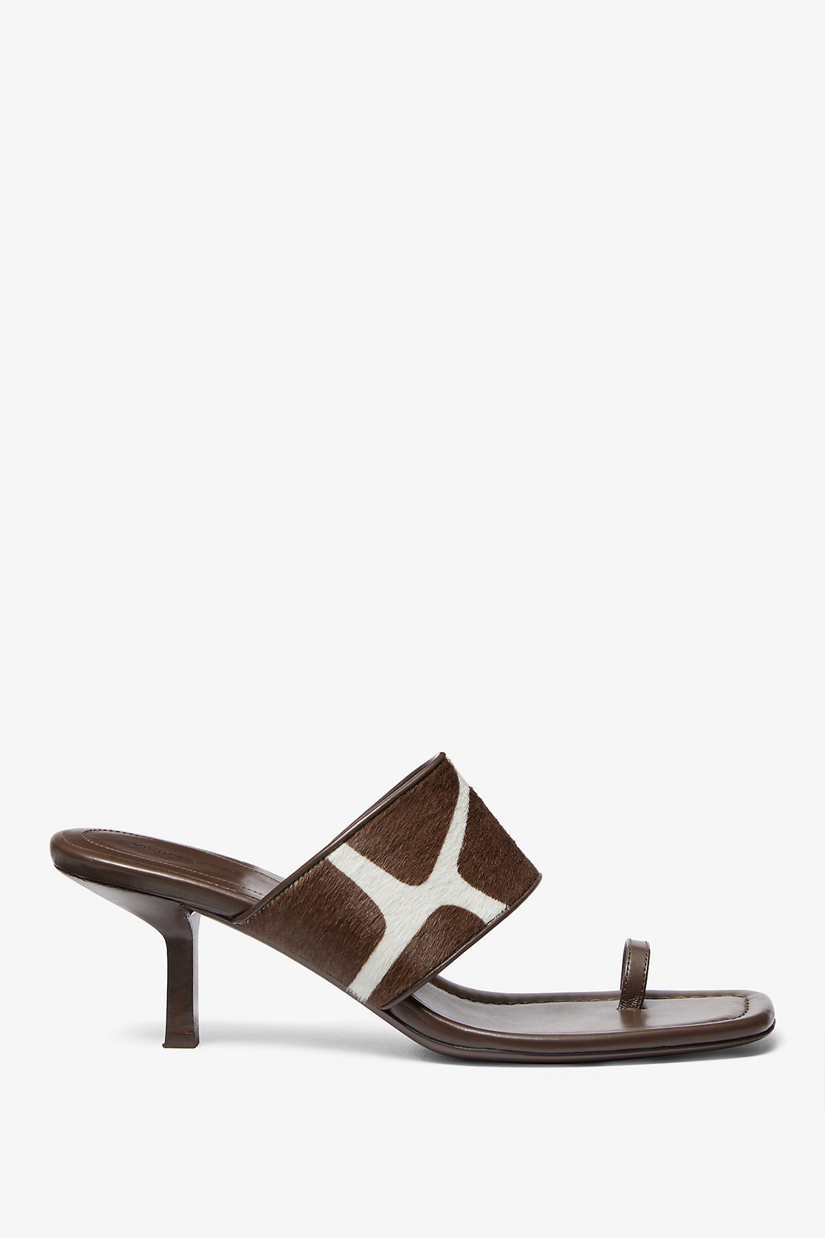
Hear that sound? No, I'm not talking about the birds chirping but rather the continued noise surrounding one specific trend: animal prints. What's kept this trend at the top of the fashion kingdom is how it has continuously evolved, even in more recent seasons. You can chart their adaptation in how F/W 23 collections featured life-like anatomical-shaped prints that were a bit harder to style. Meanwhile, S/S 24 shows had more traditional spotted patterns, making them more approachable. Admittedly, most "classic" critter motifs can sometimes feel cliché, but designers made them feel chic this season by incorporating them into contemporary silhouettes.


Typically loud by nature, animal prints aren't exactly the quietest thing you can wear, yet this season, it felt as if these patterns were shedding their previous connotations in lieu of becoming a bit more domesticated. Leopard prints felt far tamer, thanks to their adaptation into tailored separates, including a low-slung pencil skirt, hourglass trench coat, strappy sandals, and structured bags at Jacquemus. Similarly, snakeskin was given a softer feel in Fendi's spring collection by pairing a serpent-inspired print coat with seafoam green gloves, a pastel blue knit top, and a matching skirt. And then, there was Michael Kors' collection, which brought back giraffe print in the form of a pony-hair peacoat with a matching crescent-shaped bag and sandals. Although every designer had their animal print of choice, overall, each managed to contain the prints to the confines of the Zoo (or, in this case, the fashion world).
Shop the trend:
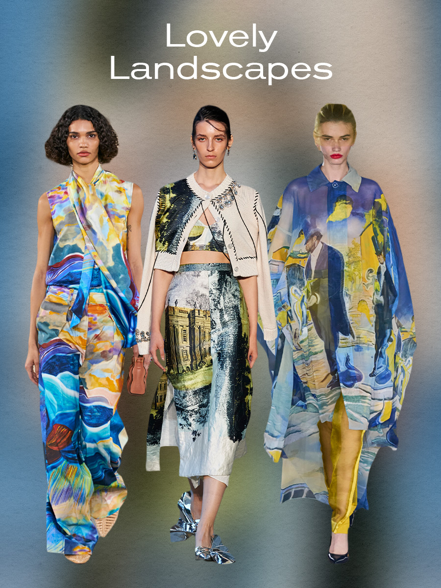
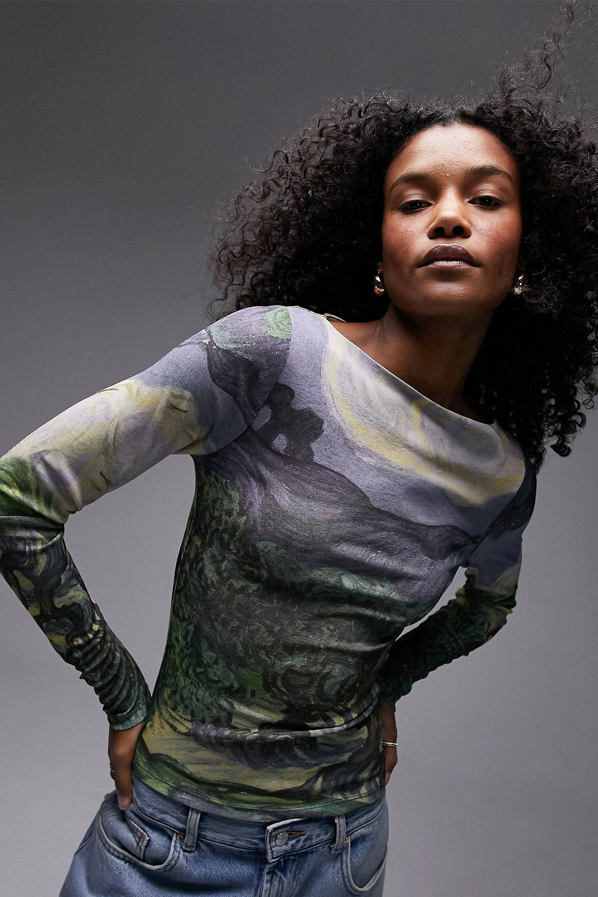
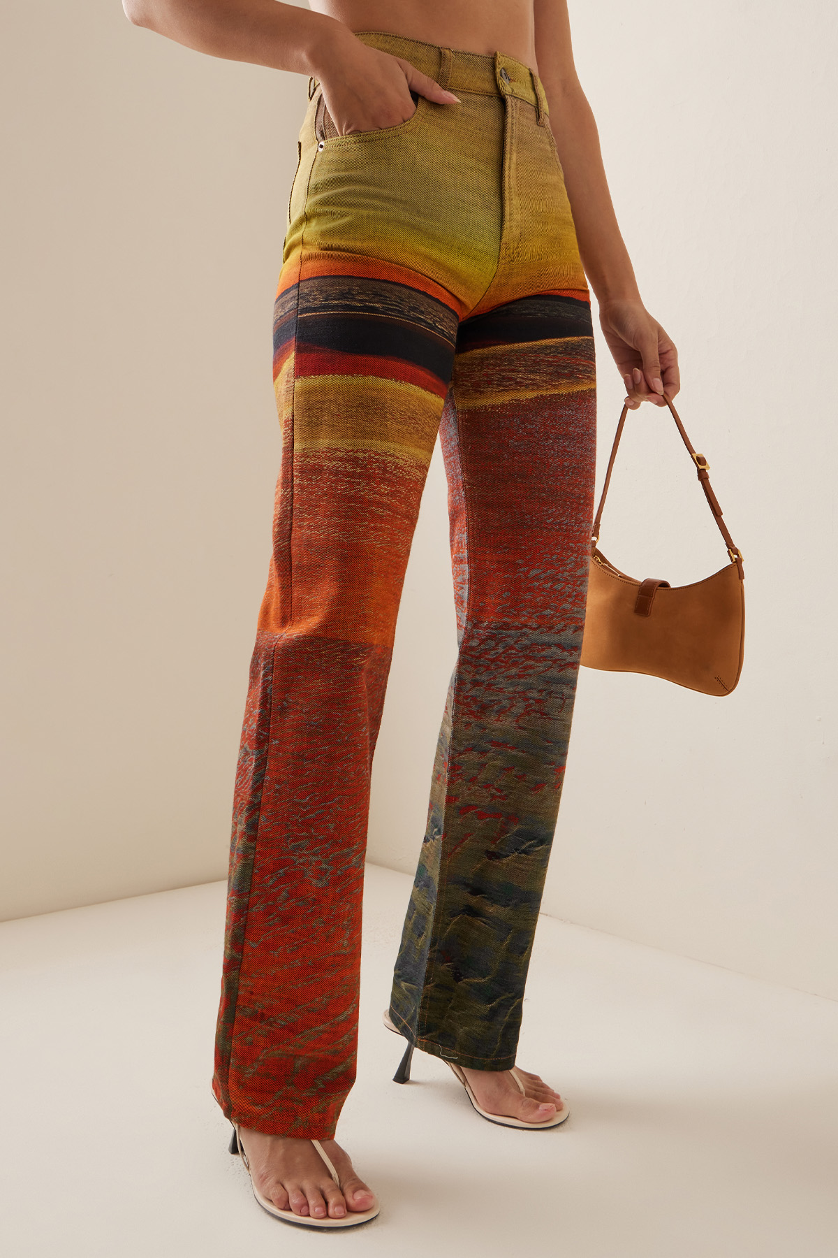
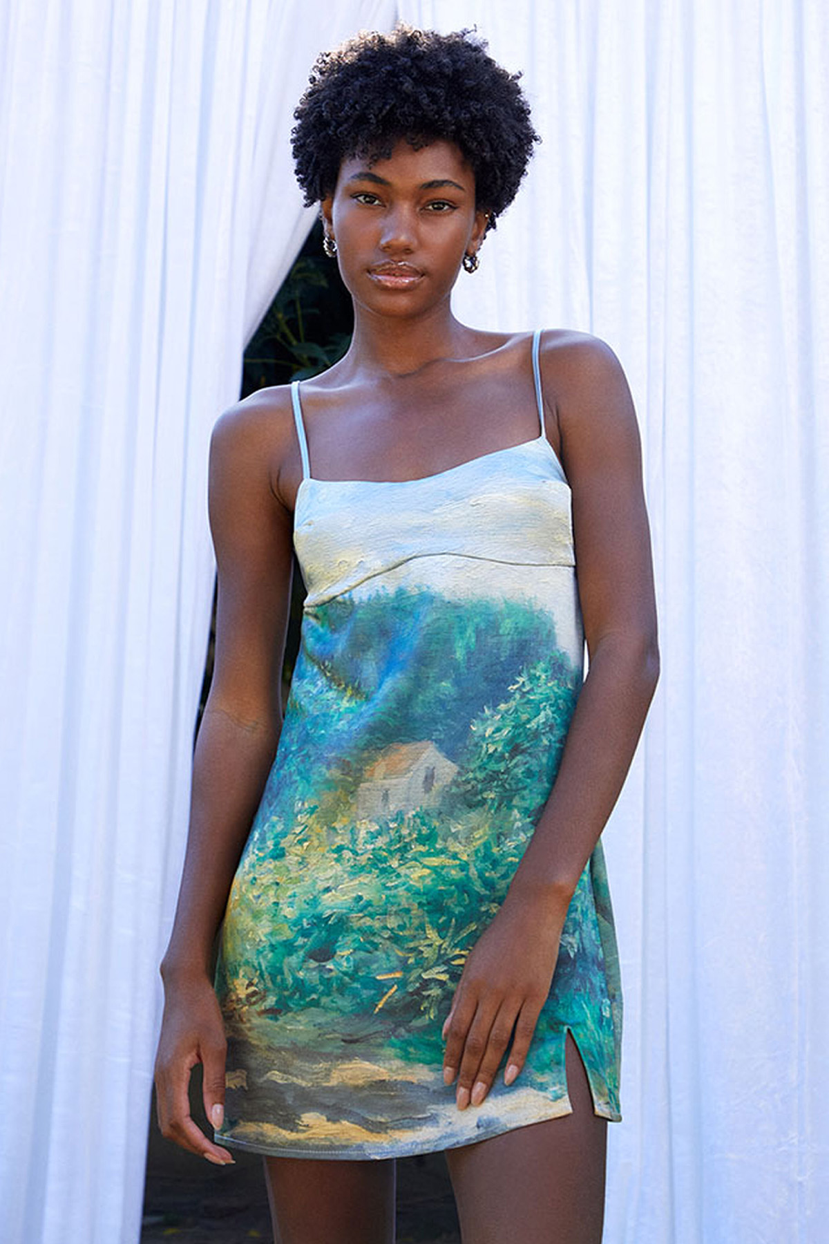
Every art form reflects the world around us, but that idea was no more evident than with the debut of S/S 24 runway collections. While some designers chose to reflect the animal kingdom—thereby acting as a symbolic exploration of humans' relationship to nature—others focused on the spaces around them (quite literally). Across various collections was a sweeping embrace of landscape-inspired prints depicting the countryside, cityscapes, and even some parts of civilization. But what made these prints distinct wasn't just that they felt reminiscent of traditional landscape paintings and were brought to life through tailoring. A prime example was Ulla Johnson's S/S 24 spring show, where the designer collaborated with Brooklyn-based artist Shara Hughes to turn various paintings into prints. As explained in the show notes, the collection was "profoundly inspired by the interconnectedness of art forms." That aim was felt in how the whimsical watercolor strokes suddenly became sharper with tailored separates—such as a landscape print satin pussy-bow blouse with matching relaxed trousers.
While Ulla Johnson's collection was a meditation upon the movement found in natural landscapes, Erdem's collection centered on urban terrain. More specifically, the Chatsworth House, an iconic English estate, was rehabilitated by the infamous socialite Duchess of Devonshire. Erdems's collection aimed to "mirror the symbiotic relationship between house and human" by incorporating elements that nodded to the location—look to the photographs of the estate screen-printed onto a silk bra top, pencil skirt, and mended cardigan as an example. While Erdems's collection explored an individual dynamic between a place and a person, Undercover felt universal by making it an homage to things that were "lost." The collection explored grief, which was reflected through the incorporation of surrealist paintings by Neo Rauch. Sheer button-down shirts, tailored trenches, and deep-v neck dresses all depicted a world that no longer existed for the designer [Jun Takahashi] and the audience—begging us to reflect on how our lives are intertwined, informed, and inspired by the spaces around us.
Shop the trend:
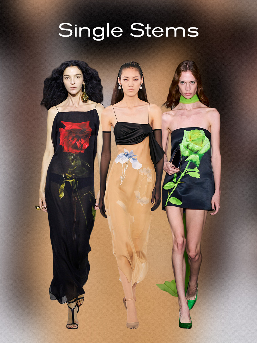
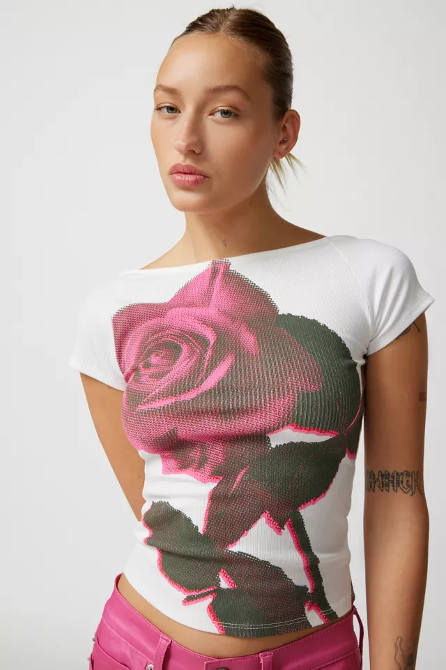
If it’s not clear already, let me reiterate that designers were seemingly all about taking notes from the natural world to inform their collections this season. That aim was reflected through the various prints incorporated—animals, landscapes, and even flora were found everywhere. With the latter, we mainly saw this pattern trend begin to bloom in S/S 24 collections (excuse the pun). Of course, I’d be remiss if I didn’t acknowledge that we always manage to see floral prints sprout back up around the springtime; it’s a fact of life now, so don’t come for me. But with recent collections, there seemed to be a collective shift away from the floral print pieces of our adolescence to something more grown. It was less about wearing the more “frilly” over-the-top floral pieces covered in the motif and more about taking a more minimalist approach—reflected through the adoption of single-stem floral prints.
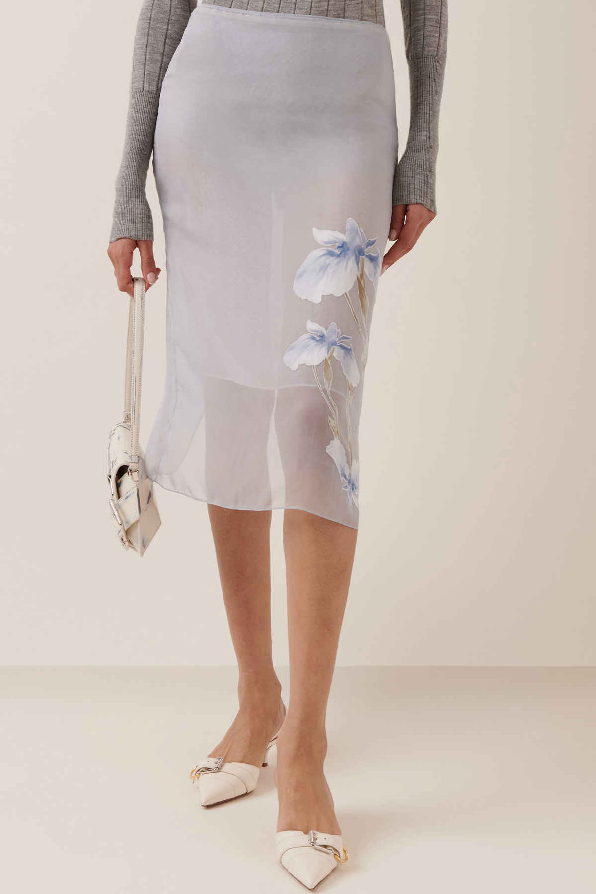
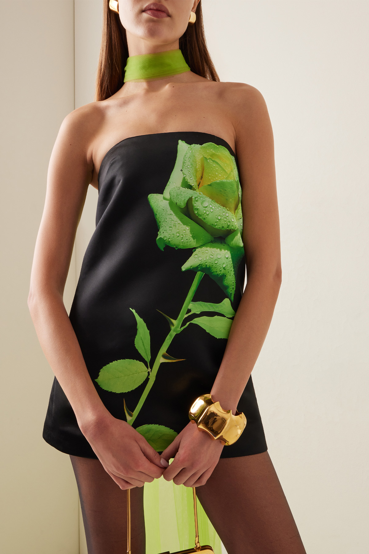
Just to be clear, these floral print pieces are just as pretty as the ones of the “past.” But instead of relying upon more flowers to get the print’s point across, designers used tints and textiles to make them stand out. For example, in David Koma’s collection, color was used to make the print contemporary—a single oversize acid-green rose adorns the front of a black satin shift dress. Similarly, at Alexander McQueen, we saw the color of the print and the textile it was printed on make it stand out. Sarah Burton’s last collection for the atelier, most notably, featured one look in which a black slinky chiffon slip dress was even more beautiful with the addition of a screen-printed photograph of a blood-red rose. Lastly, there was Givenchy’s collection, in which the former creative director, Matthew Williams, deviated from the single-stem roses spotted in other collections instead of irises. Drawing from the house’s archives, runway looks featured pastel-hued chiffon slip skirts and draped dresses, all printed with faint irises. The overall result was a series of prints that single-handedly made florals feel fashion-forward again.
Shop the trend:
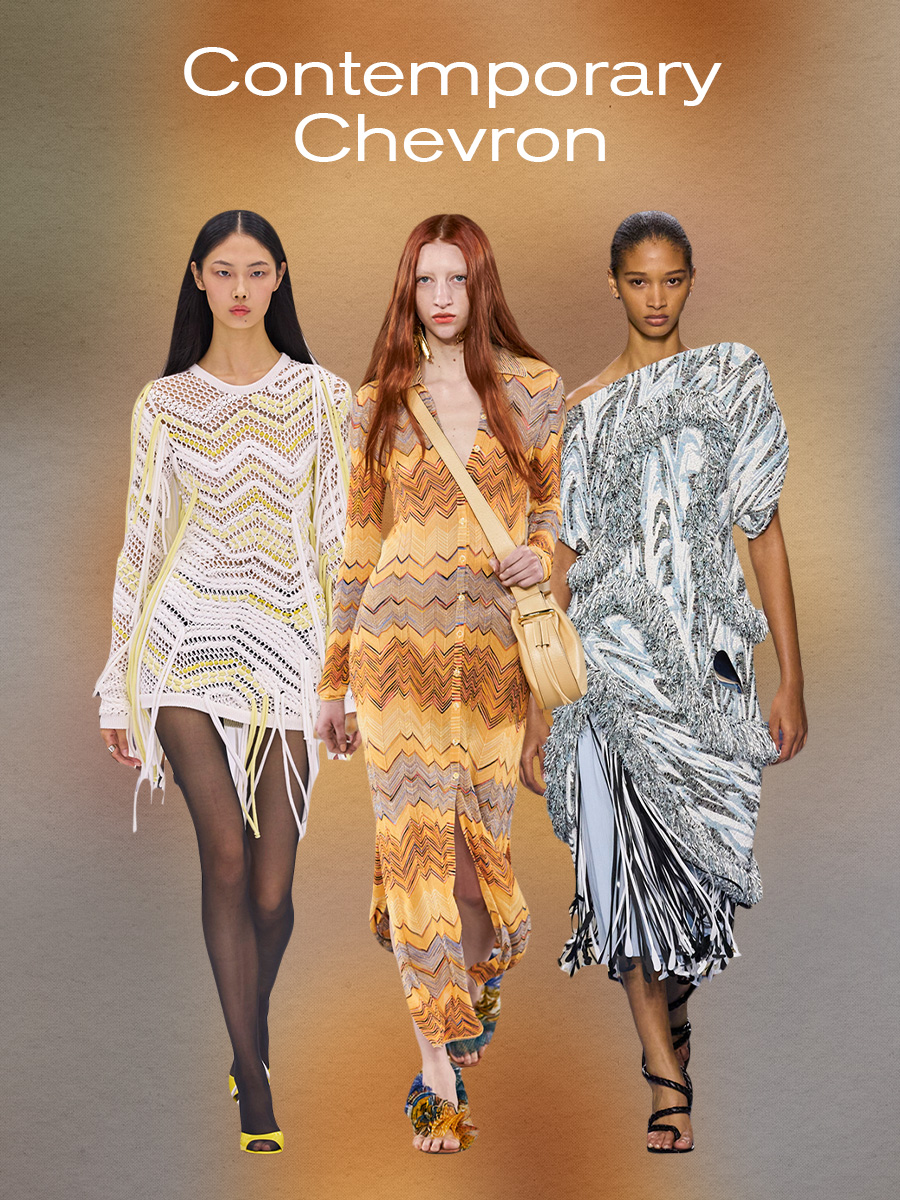
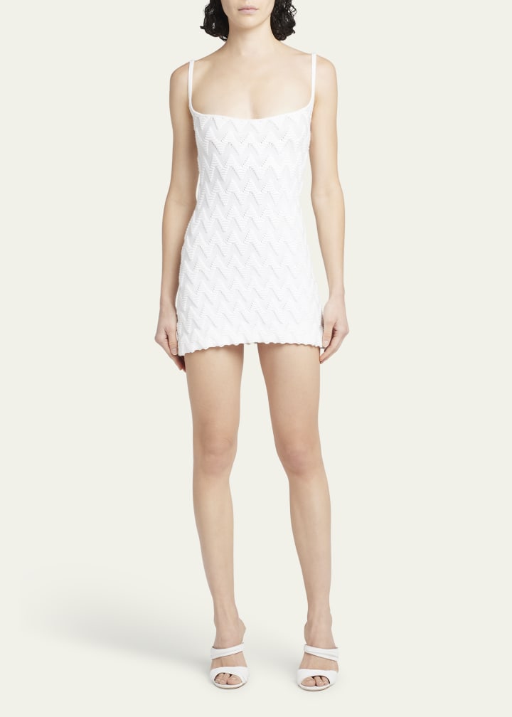
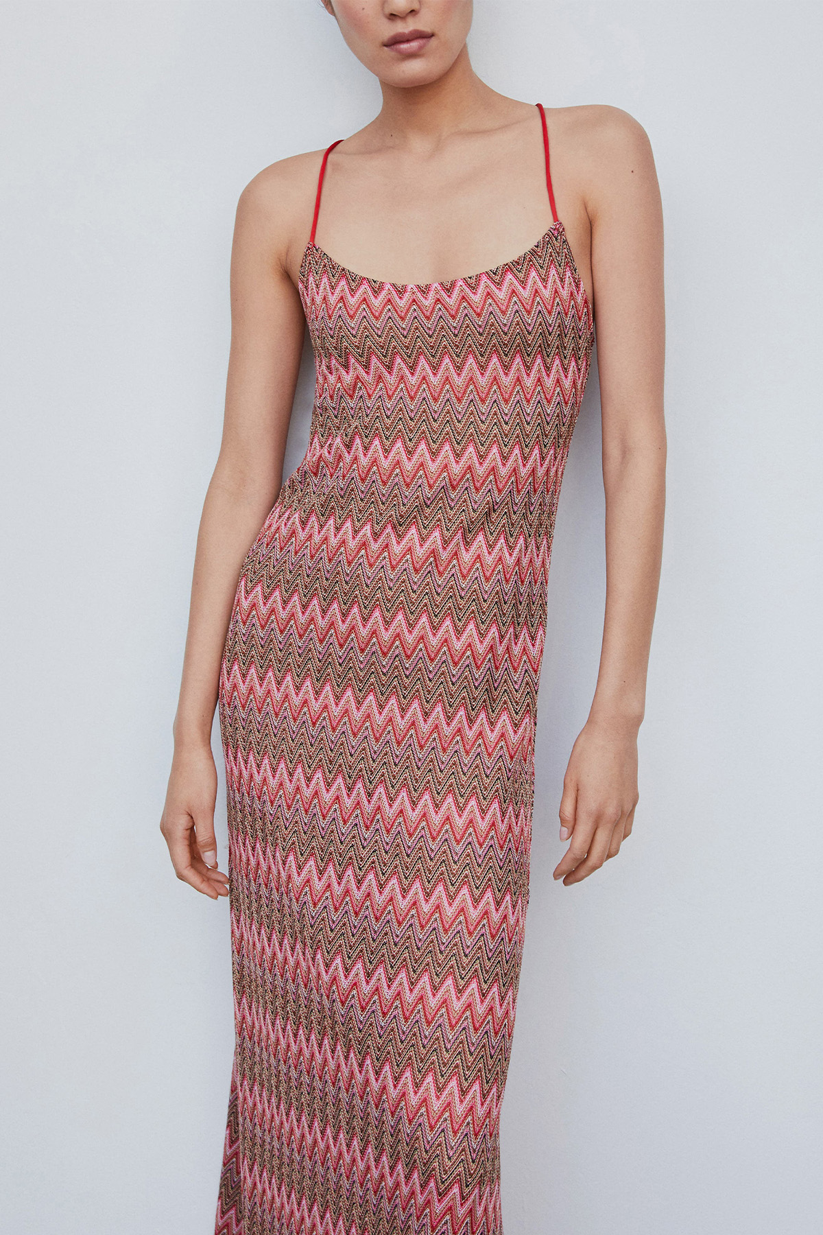
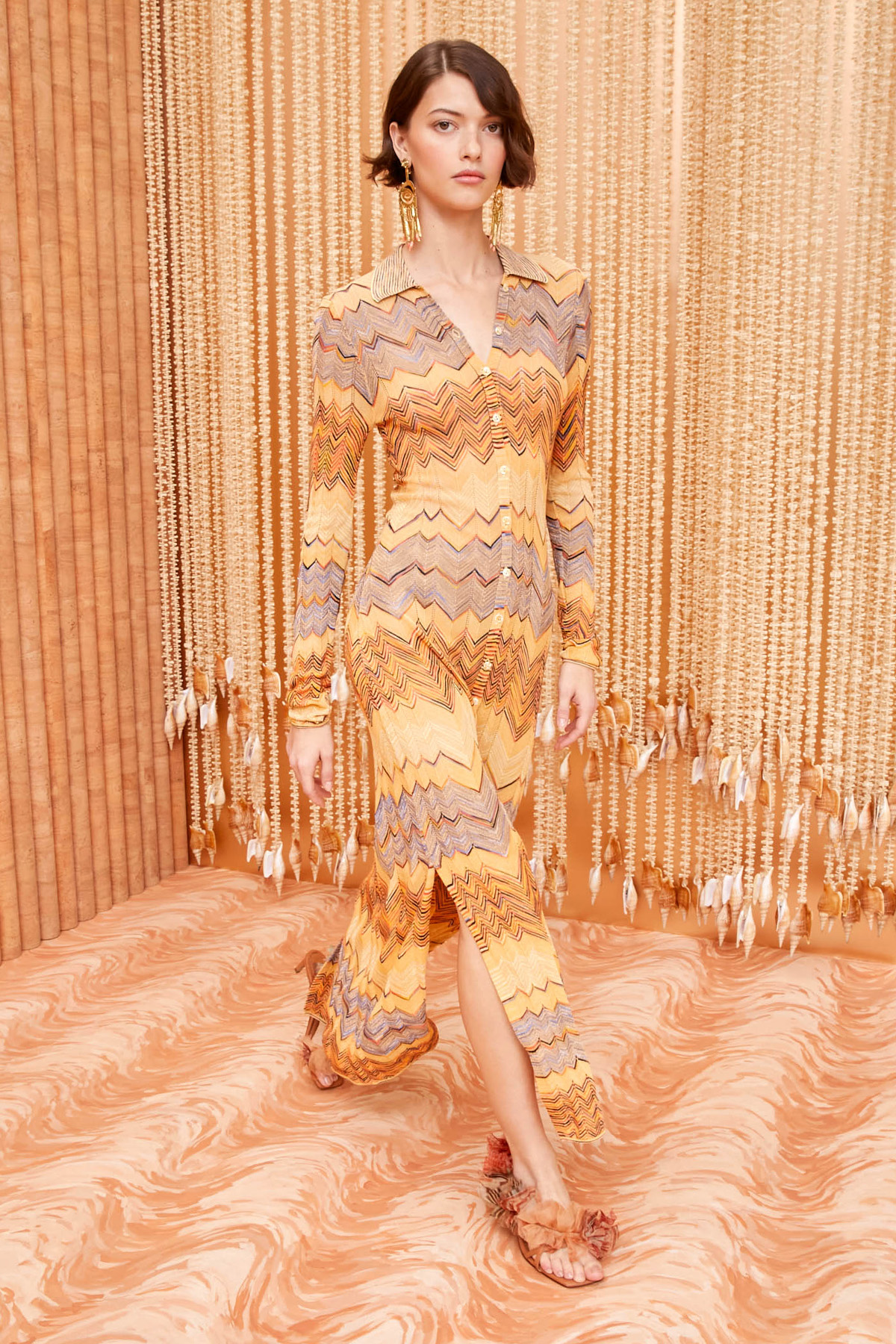
If we're being honest, some print trends don't always feel contemporary—chevron can be one of them at times. First popularized during the Art Deco movement through the '20s and '30s, the print is characterized by its signature zig-zag pattern, typically created by weaving techniques. As fashion became more commercialized over the last century, many weaving techniques central to creating chevron were ditched in lieu of cheaper methods (aka screen printing), thus making this print feel less chic. But in recent years, we've seen luxury houses make craftsmanship cool again, thereby charting the inevitable comeback of chevron. We saw this print in various S/S 24 runway shows, including the Italian fashion house synonymous with the motif for years: Missoni. Although the brand has used this pattern since the '50s, it feels mainly rooted in the present day because of how playful its interpretations are in the collection. The brand's show notes noted, "This collection arises from a cheerful question: How do you enjoy reality? The answer materializes in exploring the joys of matter, shape, and color."
That aim was felt throughout the collection's usage of sorbet hues and sheer layers, but it seemed the most apparent in the form of a chevron-print minidress that was deconstructed to create a long yellow and white fringe. The joyful take on this print trend wasn't just present in Missoni's collection; we also saw it in Bottega Veneta's collection. As the creative director, Matthieu Blazy, explained in the brand's show notes, it was meant to represent an odyssey. A journey that is both free and hopeful… It's embracing something freeform: these are clothes without codes." The idea of finding freedom felt particularly influential to incorporating prints into the spring collection—particularly with the more casual take on chevron in the form of an asymmetrical fringe knit dress. Unlike the classic form of chevron in which the sharp angles are all symmetrical, the dress veered into the territory of being an imperfect flame stitch pattern, making it feel a bit more free-flowing. Adding fringe to the dress cemented the feeling that the chevron print in Bottega Veneta's collection broke from the code; that's not the only way designers made this print feel current. Arguably, the best way designers brought chevron back into the conversation was by applying the print to contemporary staples—e.g., the knit button-down cardigan dress from Ulla Johnson's spring collection. Doing so gave the print a second chance to bring joy to our closets again.
Shop the trend:
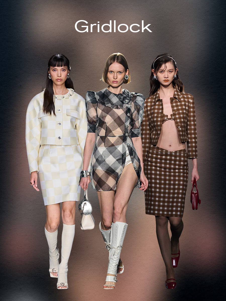
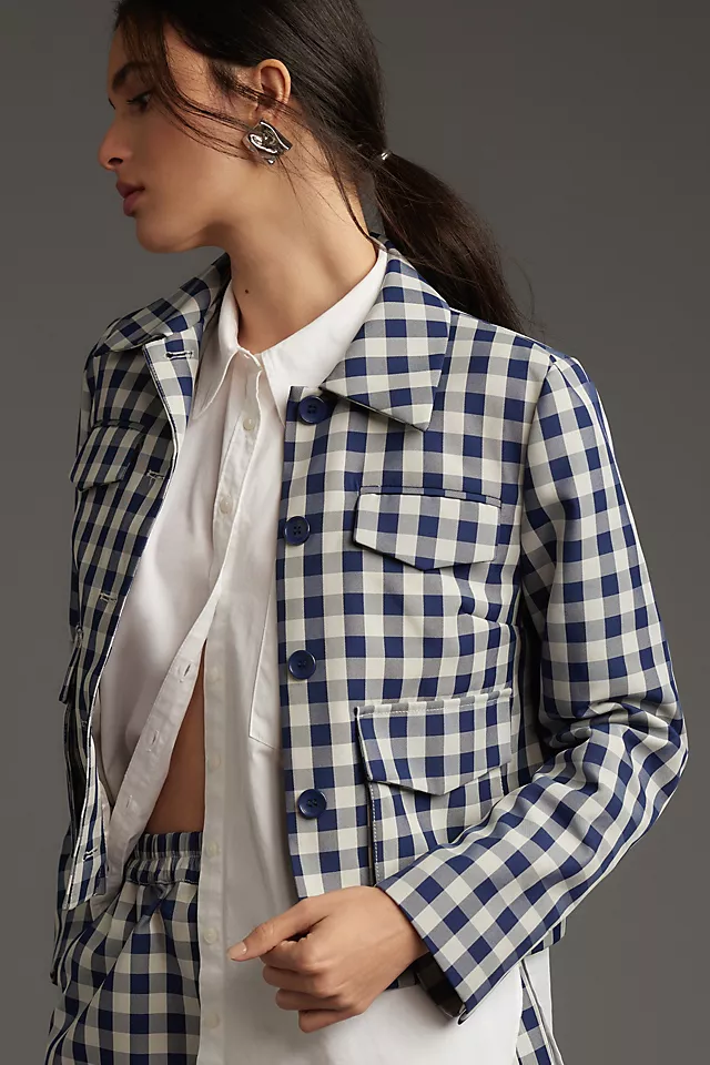
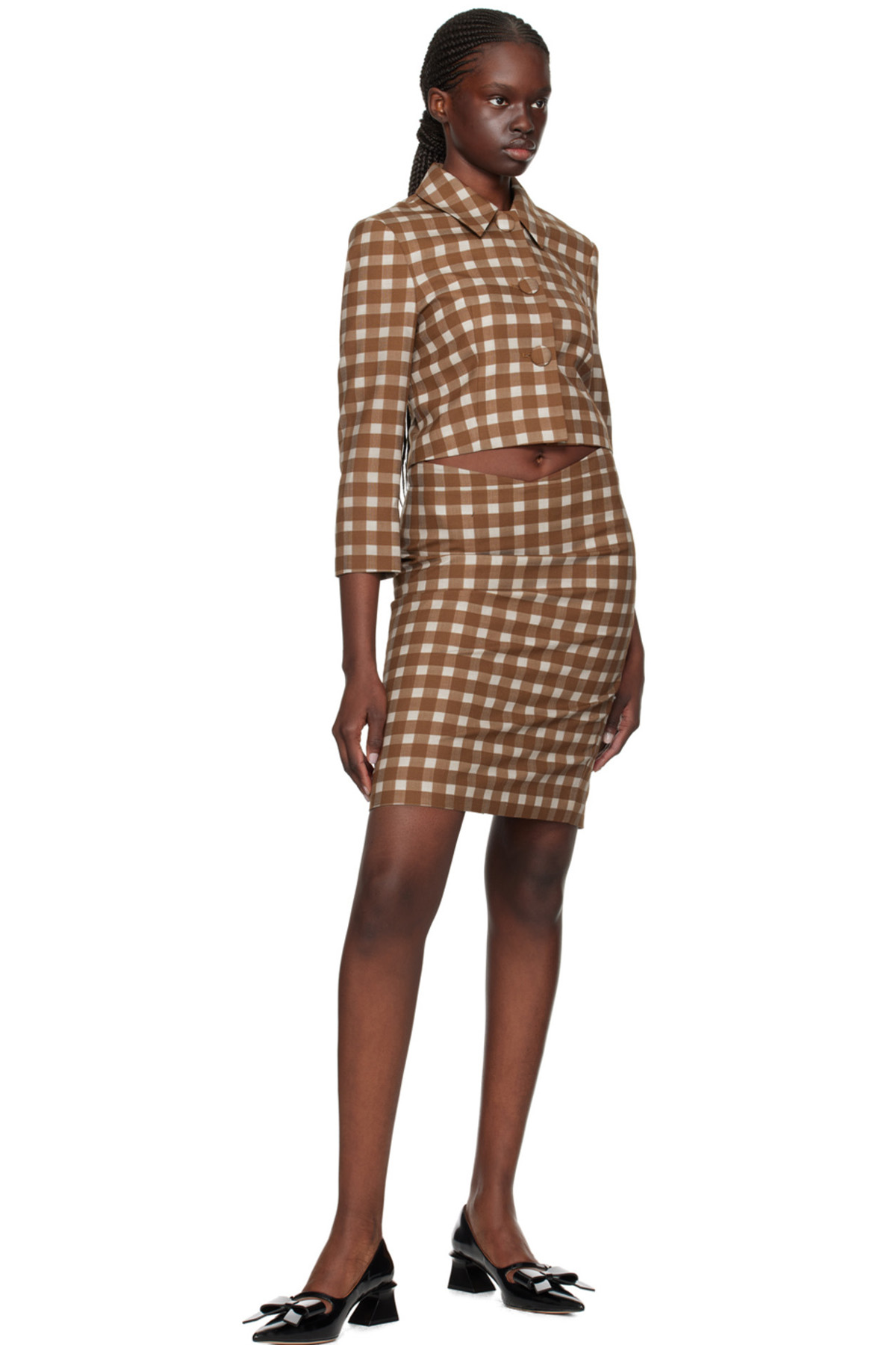
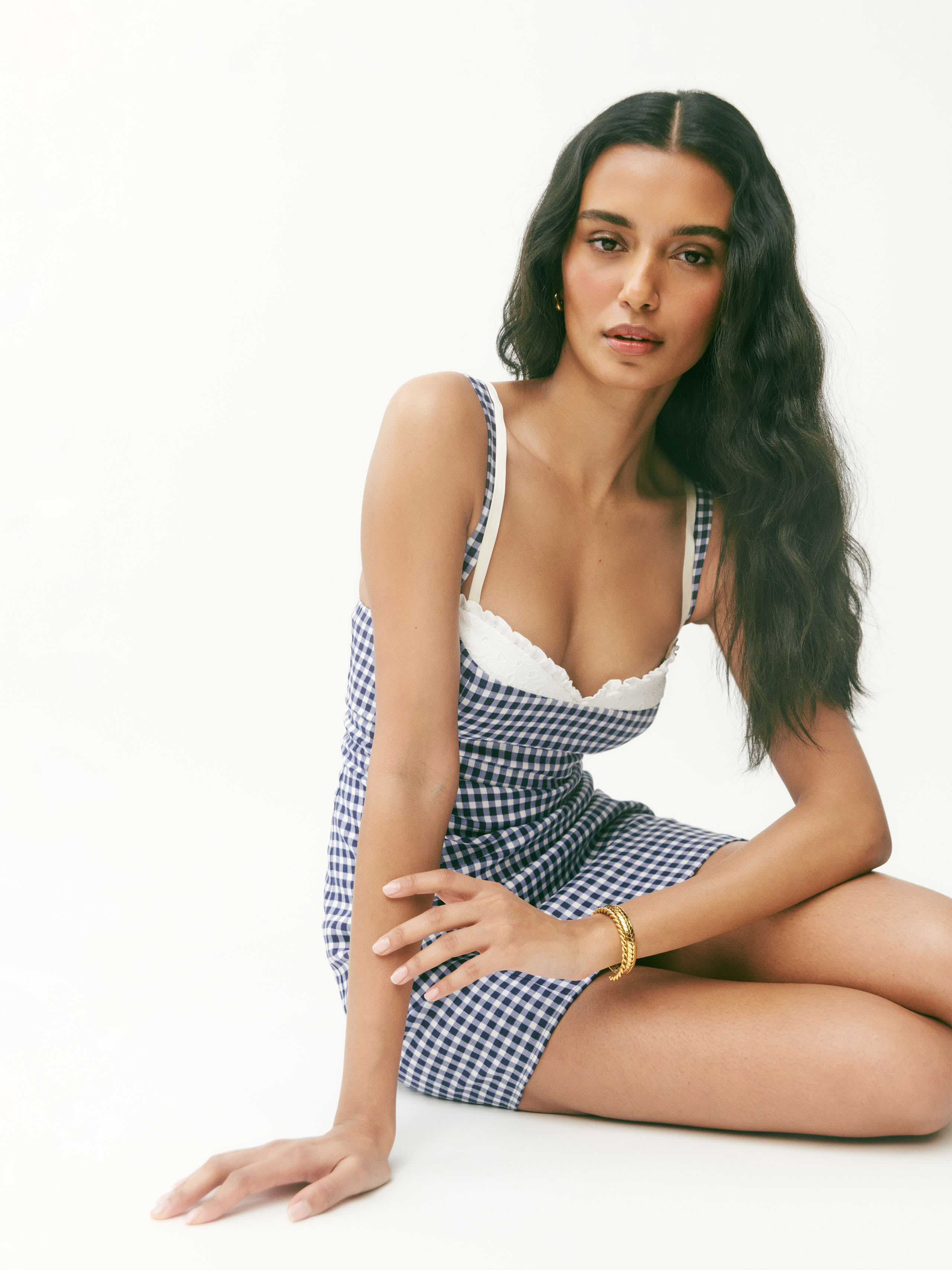
Chevron wasn't the only print trend that was given a spicy upgrade this season. There was another trend that had runways on lock: grid-inspired patterns. It’s a given that once spring rolls around, gingham and checkerboard prints happen to come back. While it’s true that these prints can sometimes feel passé (they’re often what one imagines wearing on a picnic in the park on a warm spring day), any former connotations of this print being the embodiment of “sweet” were swept under the rug this season. Designers showed how provocative and powerful this print can be by adopting sultry silhouettes, streamlined shades, and sheer materials. With the Shanghai-based brand ShuShu/Tong, they noted that the inspiration for their S/S 24 was Helmut Lang’s "Big Nude” photograph and that it was “the central theme of the collection, for what signals it [the photograph] conveys are not of sensuality but rather a vibrant expression of female power… The collection explores the edge deeply rooted in every woman’s body, unveiling their authentic, and perhaps concealed, strength.” What better way to display women’s “soft power” than taking a gingham print and applying it to a low-slung form-fitting pencil skirt with a matching cropped coat and exposed bra top?
There are very few better ways, although Alessandra Rich’s approach was equally as potent. In the brand’s S/S 24 collection, instead of relying primarily on silhouettes to give this print edge, textiles were central to the collection—refer to the runway look with a chiffon puff-sleeve blouse in black and white gingham that was layered over white briefs. Using sheer fabrication, the print made even more of an outsized statement. While both Alessandra Rich and ShuShu/Tong’s collections gave the print a more sensual feel by showing more skin, Versace chose to use a “soft” color palette to achieve the same effect. Checkerboard prints in shades of white, beige, baby blue, and pastel pink were given a cheekier edge by being applied to cropped cocoon jackets, tailored skirts, and shift dresses. The outcome was a series of runway looks that allowed us to think outside the box and redefine what “femininity” and “power” look like, one printed piece at a time.
Shop the trend:
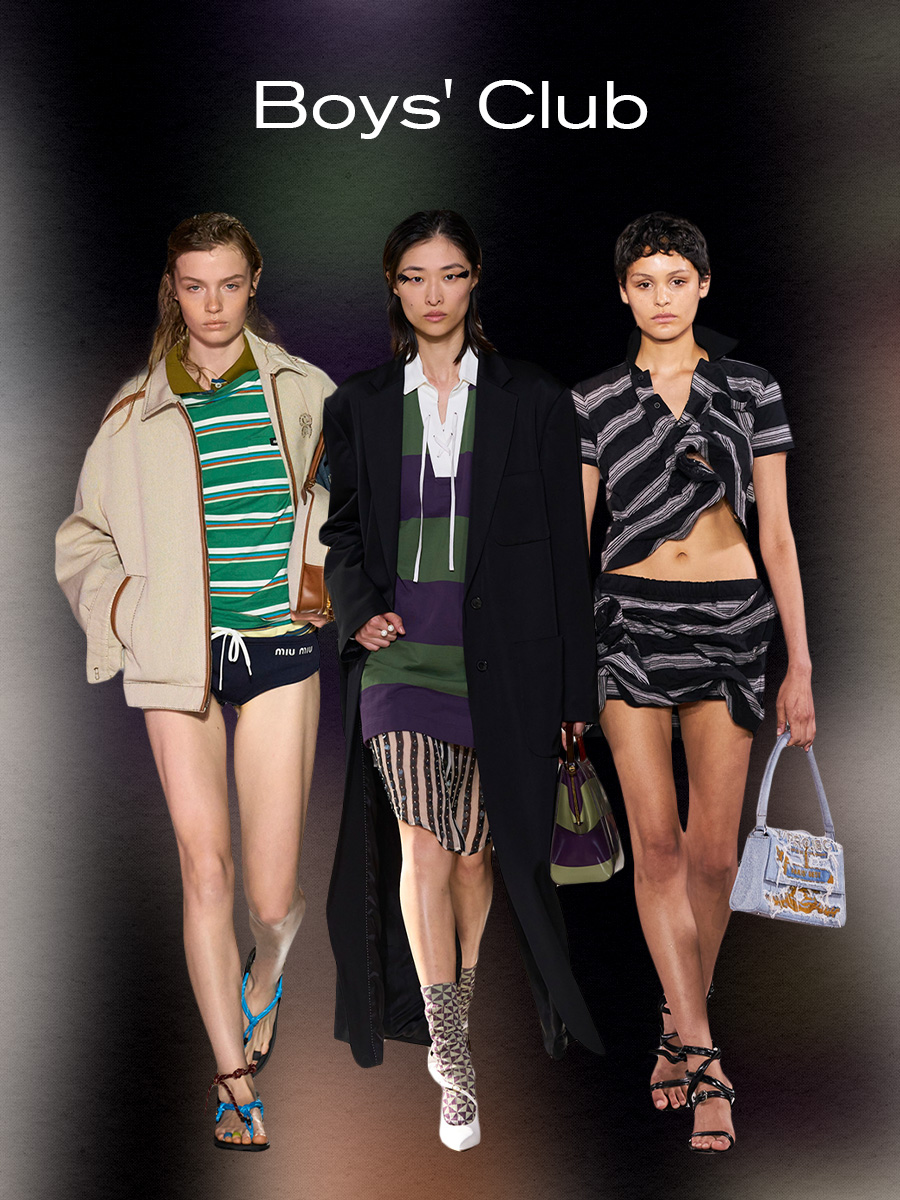
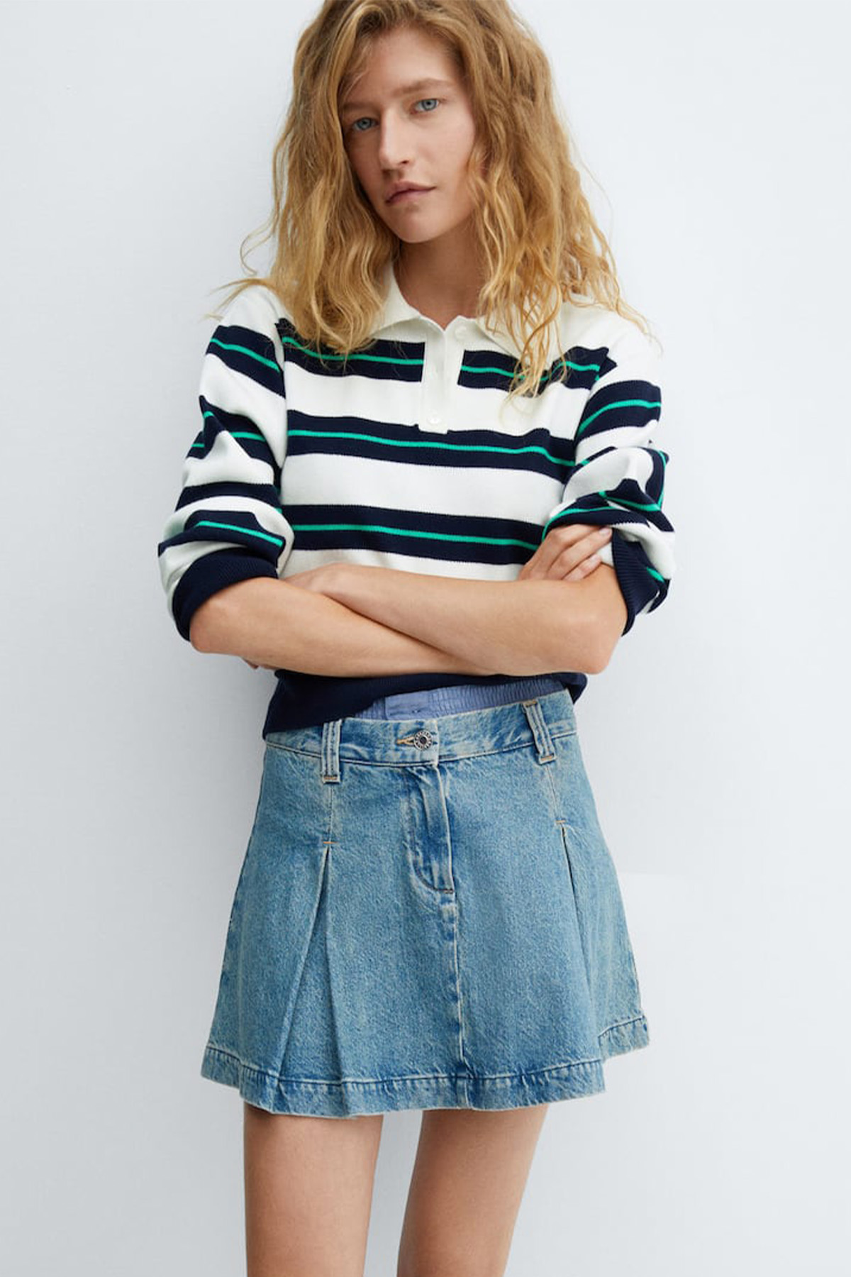
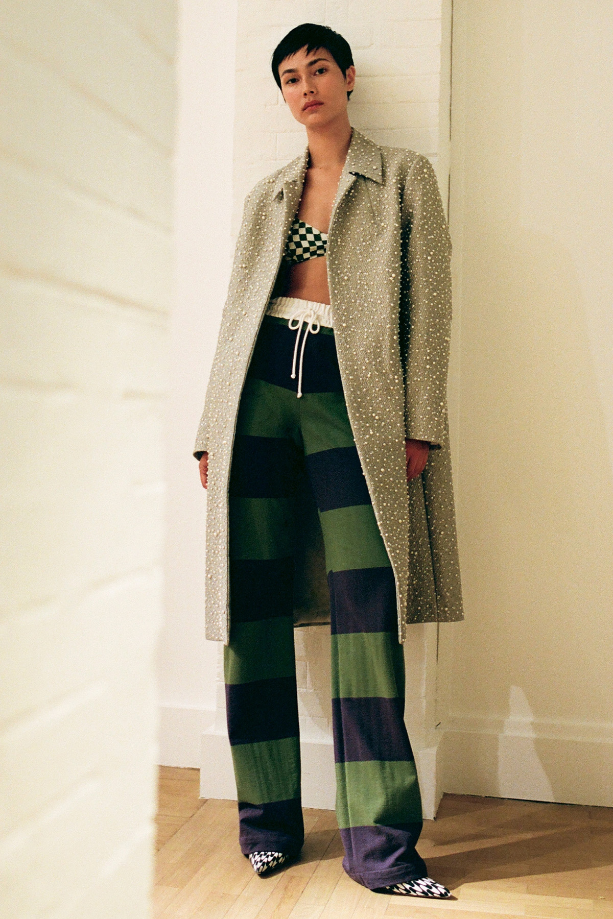
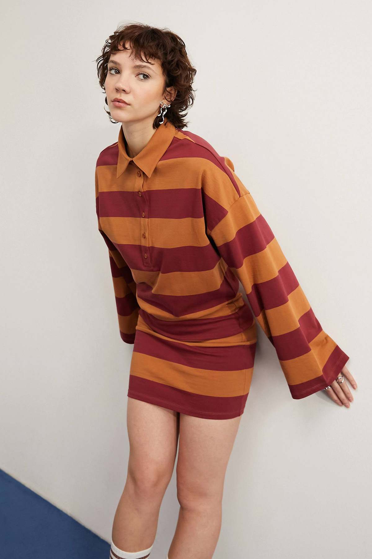
Unless you’ve been living off the grid, chances are you’ve been aware of the rise of the girlhood trend—a fashion aesthetic that’s derivative of reframing one’s relationship with femininity by embracing “traditionally girly” things, such as appliqué bows, pastel colors, and frilly prints. While it’s unlikely that the trend will disappear anytime soon, we’ve begun to see designers incorporate more “boyish” elements into their recent collections, including one particular print: rugby stripes. As antithetical as it might seem at first glance, as more “feminine” details have dominated the zeitgeist, it’s also given designers the space to grapple with the more “masculine” elements of style. That’s reflected throughout S/S 24 collections, as designers took this print rooted in sportswear and academic fashion aesthetics and turned it on its head. Or at least, that was the aim of Dries Van Noten’s collection, which noted in their press release that the intention was to have “Notions of tradition re-imagined and re-energized, to develop a continued conversation exploring the tension of contrasting ideas coming together to create something spontaneous and free-thinking.”
That aim was evident in how sports attire was transformed in unusual ways to create a “feminine expression of men’s tailoring”—refer to how oversized striped polos were styled as dresses with sheer layers underneath or baggy striped trousers were paired with a bra-top and embellished coat. But it wasn’t just the looks in Dries Van Noten’s collection that managed to redefine “traditional” sportswear staples synonymous with menswear, as Miu Miu managed to do so too. Instead of incorporating more feminine details, however, Miuccia Prada made it feel like more of a rebuke of traditional beauty standards surrounding women—i.e., models sauntered down the runway with “geeky” glasses, messy hair, low-slung briefs, and disheveled layered striped polos. Similarly, we saw the more “tomboy” approach to womenswear adopted in Y/Project’s spring collection, as one model wore a crinkled-up cropped striped polo styled with a matching mini skirt, strappy sandals, and a denim bag. Ultimately, incorporating this print trend into collections paired with a more “disheveled” styling gave the illusion that the mere adoption of this trend could allow one to infiltrate the boys’ club or, at the very least, challenge the status quo.
Shop the trend:
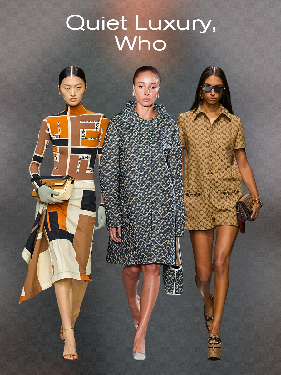
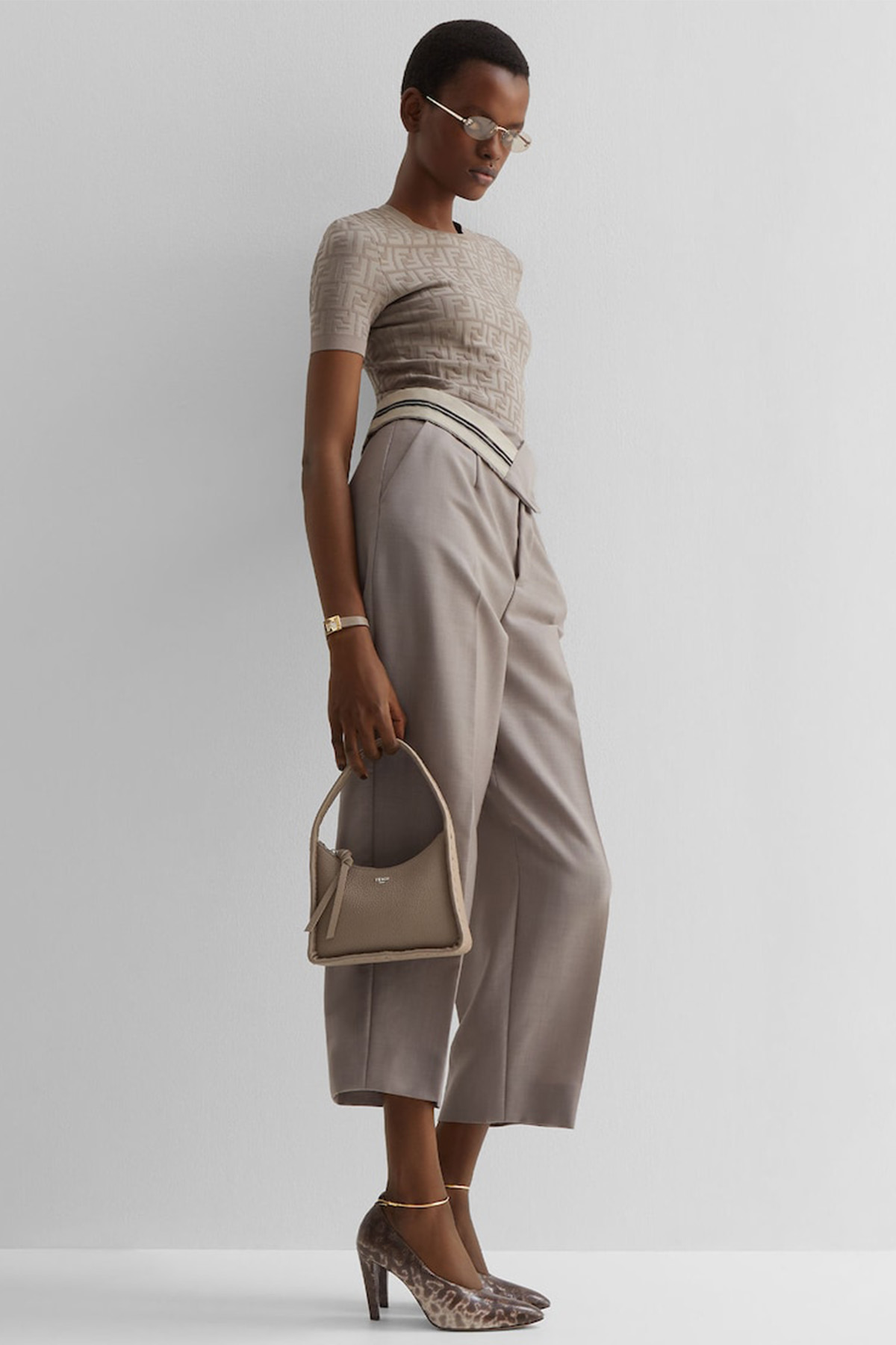
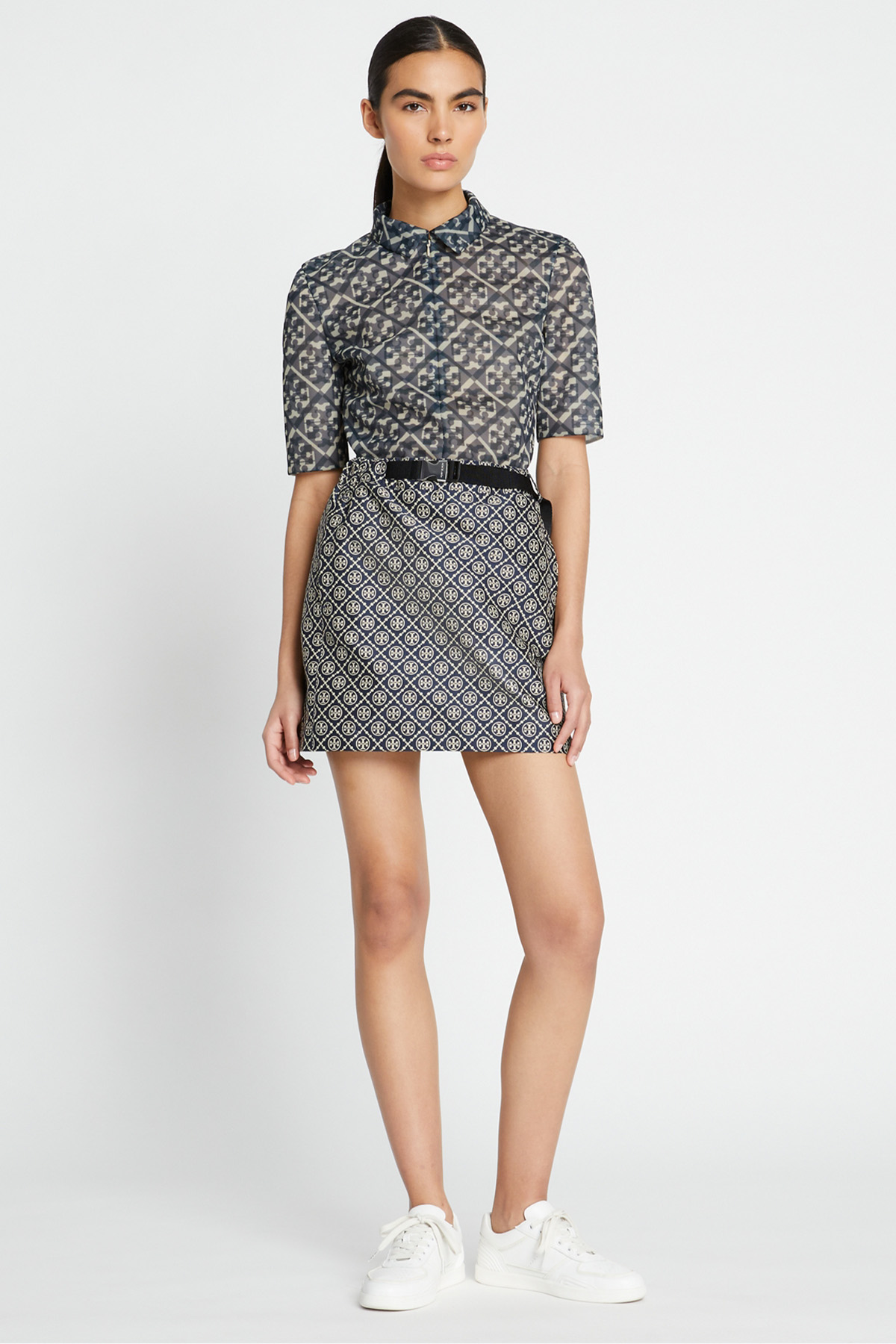
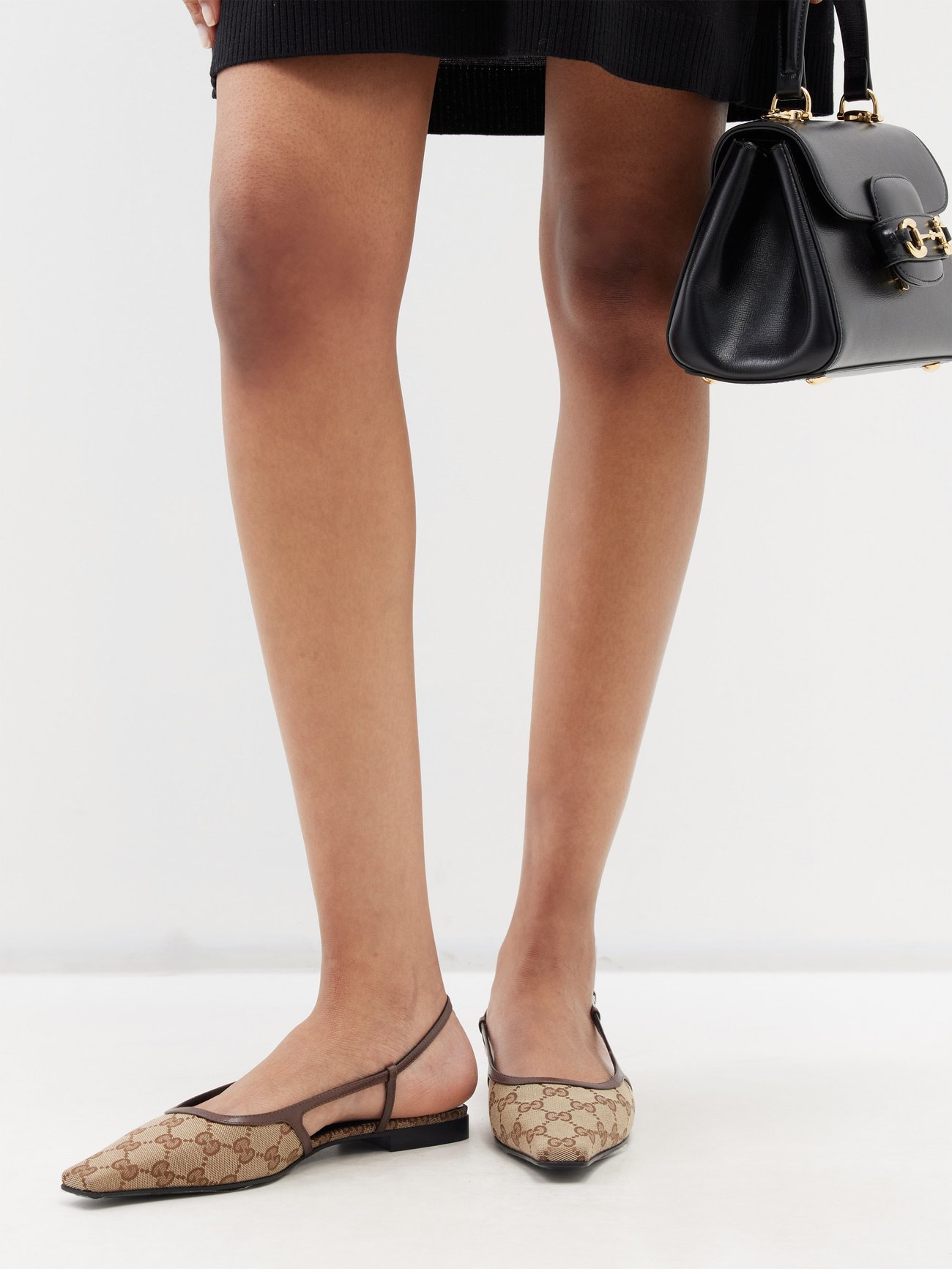
No matter how many tabs you open on the internet, one trend has seemed inescapable of late: quiet luxury. Whether you’re a fan or not, chances are you’ve been unable to ignore how we’ve seen a collective push towards more minimalist fashion aesthetics. That’s been embodied through muted colors, limited patterns, streamlined silhouettes, and no overtly “flamboyant” or “flashy” items. For many people, it was a welcome change to have luxury become more subdued compared to the late teens when maximalism reigned supreme. But alas, nothing lasts forever. While we’ll still likely see minimalism influence many collections, we’ve reached a point where the pendulum is about to swing again—case in point: the return of monogram motifs. One could imagine that when designers sat at the cutting tables to create their collections, they asked themselves, “Quiet luxury, who?” They showed that they did not know her. Nor was she in the room this season because many S/S 24 runway looks featured designer logo prints.
It wasn’t just that logos adorned accessories, but they were everywhere in ready-to-wear collections. For example, in Fendi’s S/S 24 collection, Kim Jones drew from the house’s archival prints by bringing back the color-blocking interlocking “FF” logo prints that were popular in the ‘90s. But don’t be fooled; these are by no means a reactive take on the print trend, as the collection gave the print a contemporary touch by using neutral hues and tailored silhouettes. That modern approach to monogram prints was also present in Tory Burch’s collection, in which a retro-inspired coat felt current with an overlayed logo print styled with a matching bag and square-toe pumps. And then, there was Sabato De Sarno’s debut collection for Gucci, which paid homage to the house’s history by incorporating the iconic interlocking “GG” logo into everything from patent leather shift dresses with embossed logo prints to jacquard weave boiler jumpsuits. The result was a series of collections that put a sell-by date on the quiet luxury movement.
Shop the trend:
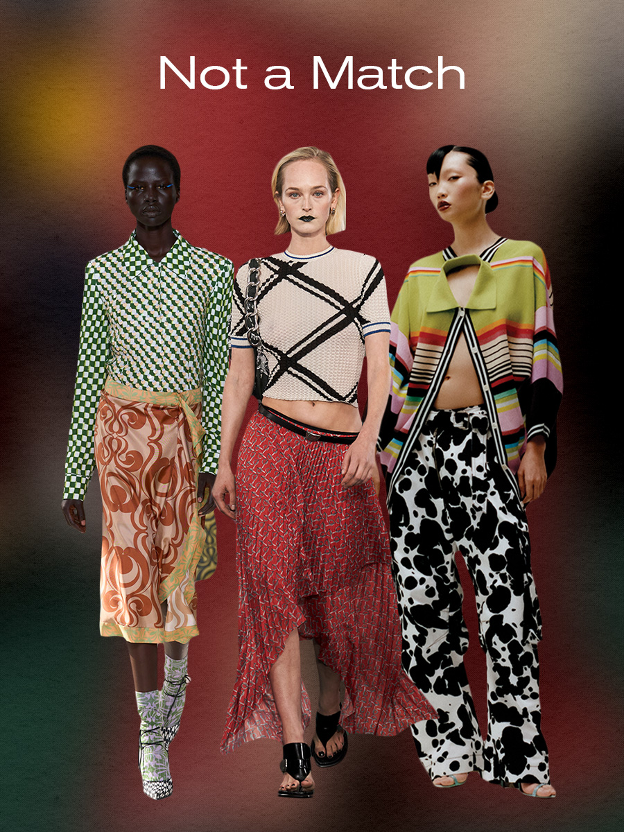
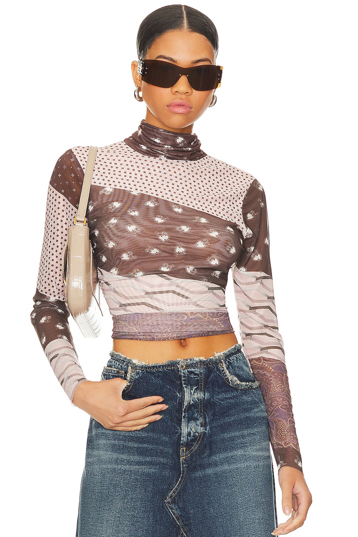
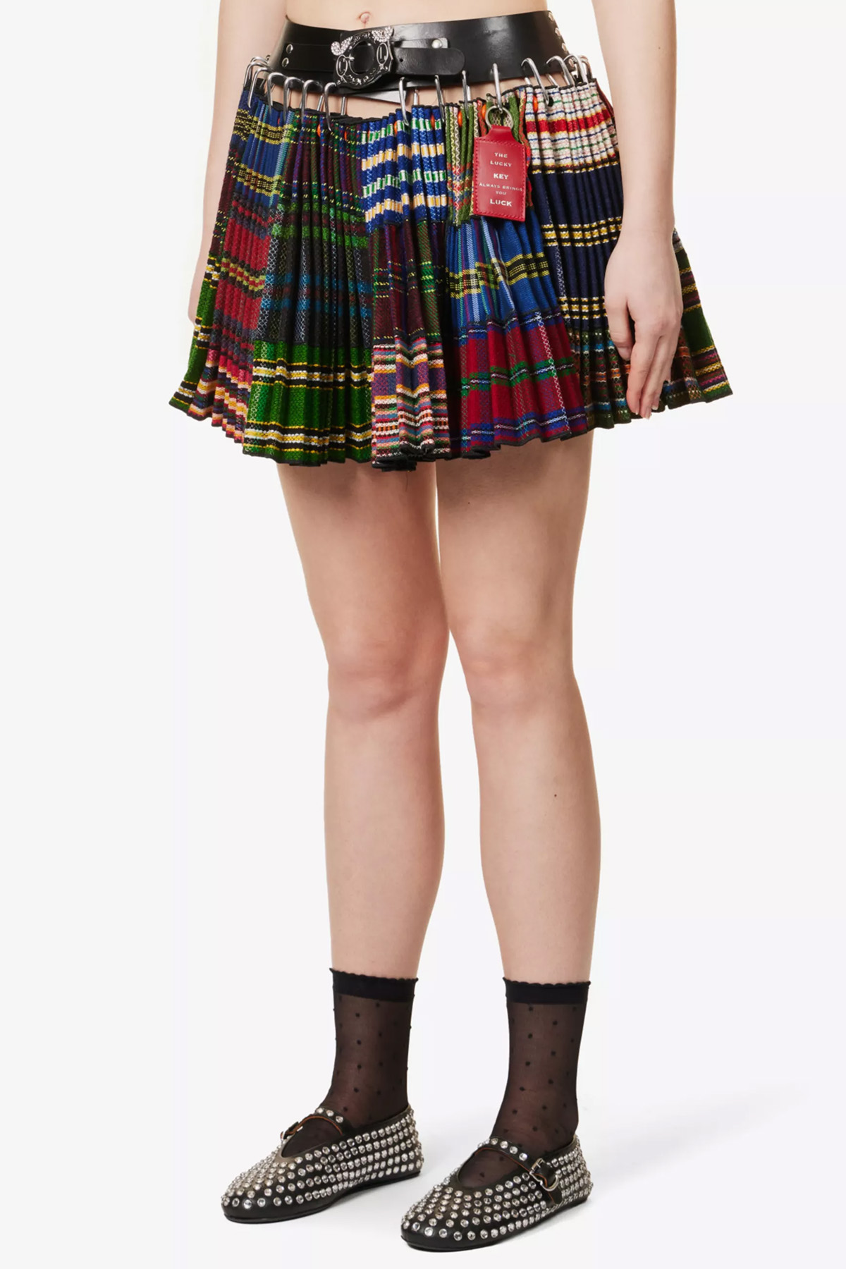
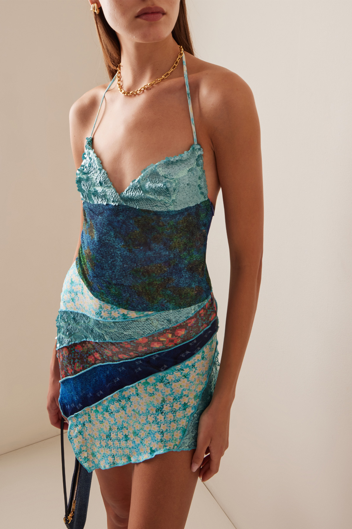
Lastly, the final trend that dominated the runways wasn't necessarily a singular pattern but rather a particular way of styling them. Instead of adhering to the minimalist aesthetics of previous seasons (which shied away from anything over-the-top), designers did the most by embracing mismatched prints. While mixing patterns isn't necessarily a brand-new concept, with so much of the cultural conversation currently favoring choosing "functional" items over "fun" ones in fashion, the embrace of this styling trend was a breath of fresh air. Especially considering that designers didn't necessarily follow some of the unspoken "rules" about mixing patterns—e.g., choosing patterns in the same color family or breaking up the look with solid colors. Rather, we saw designers choose to pair prints that were not a match to draw attention to the pieces' textures and tailoring. Take, for example, Dries Van Noten's spring collection, which featured head-to-toe mismatched patterns. Most notably, there was one look that made the subtle sequin embellishments on a green checkboard button-down shirt stand out even more by styling it with a contrasting silk wrap skirt made from two different prints, printed socks, and wavy print heels.
Mixing prints in this way allowed the designer to draw the viewers' eyes to the details of each piece, a hack in which Dries Van Noten was not the only house to perfect this season. At Burberry, we saw Daniel Lee also apply the same methodology to the spring collection, particularly in one look, which had a crinkle knit sweater with a black and white grid pattern styled with a contrasting red pleated skirt with hardware print and black sandals. The pairing of these two opposite prints brought a visual depth to the texture of each garment that would typically be lost at first glance. While Lee used prints to highlight the texture of garments, Christopher John Rodgers used them to emphasize the tailoring.
Never one to shy away from color and prints, we've become accustomed to this designer's unique ability to use details to show off his design prowess—the recent S/S 24 collection being no exception to this rule. In the collection, we saw many patterns, colors, and textures, most notably in the form of a pair of cargo pants with a splattered black and white print paired with a deconstructed polo in a multi-color stripe. The look exemplified the aim of the "not a match" styling aesthetic, which is to draw attention to the details that make each garment unique. We give so much lip service to the idea that "less is more," but with this print trend, we were reminded that just because clothing isn't minimal, it doesn't mean it lacks intention.
Shop the trend:
Jasmine Fox-Suliaman is a freelance writer and editor living in New York City. What began as a pastime (blogging on Tumblr) transformed into a lifelong passion for unveiling the connection between fashion and culture on the internet and in real life. Over the last decade, she's melded her extensive edit and social background to various on-staff positions at Who What Wear, MyDomaine, and Byrdie. More recently, she’s become a freelance contributor to other publications including Vogue, Editorialist, and The Cut. Off the clock, you can find her clutching her cell phone as she's constantly scrolling through TikTok and The RealReal, in search of the next cool thing.
