Hollywood's Color Expert Showed Us How to Tackle Spring's Most Terrifying Hues

There was a particularly moody smattering of clouds hovering above downtown Los Angeles as I crept slowly along the 101 South. After weeks of dealing with nonstop rain, I was beginning to feel out of place in our reliably sun-soaked city. But as soon as I stepped foot in the space where we were shooting with Erica Cloud, I felt as though someone had dialed up the saturation—my mood lifted almost instantly.
I turned a corner to find an energetic Cloud standing next to a rack of clothes holding pieces she had pulled for the day’s shoot. Electric neons fused with rich earth tones and softer pastels. If the thought of such an uncanny mashup of colors makes you nervous, you'd be in good company, but Cloud is somewhat of a savant at styling color, so she breezed through the rack like a natural.
“I think about [color] a lot because I think it actually loans to confidence,” she muses, acknowledging the transformative quality it can have. “People are scared of it until they put it on.” Though she’s never one to shy away from a statement color (or three), she admits that for us civilians, wearing bright colors can be intimidating at best and truly fear-inducing at worst.
This is precisely why we tapped Cloud in the first place: to show us how to wear the spring colors we (and our readers) agree are most polarizing—neon green, orange, and chocolate brown, to be exact—and be able to pull them off like we know what we’re doing.
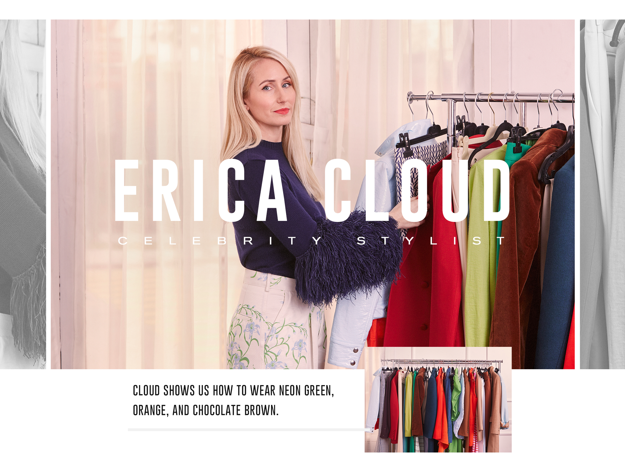
We caught up with the seasoned celebrity stylist fresh off the heels of an award season where she was busy crafting the red carpet looks you were probably DM'ing your friends about. (Kacey Musgraves in a Barbie-pink tulle confection at the Oscars? That was all Cloud.)
She’s built up a reputation in the industry for encouraging her roster of A-list clients to go outside their comfort zones. In fact, Cloud defines her sartorial calling card by her use of color, clean lines, and monochromatic ensembles, just like Musgraves at the Oscars, noting, “I think there’s such strength in [wearing head-to-toe color] that highlights the silhouette, and I don't think you need a ton of bells and whistles.”
Speaking with her, you get the sense that this decisive nature has contributed to her overall success as a stylist, and it’s apparent in every choice she made during our shoot today—she didn’t hold back even one bit with her color choices.
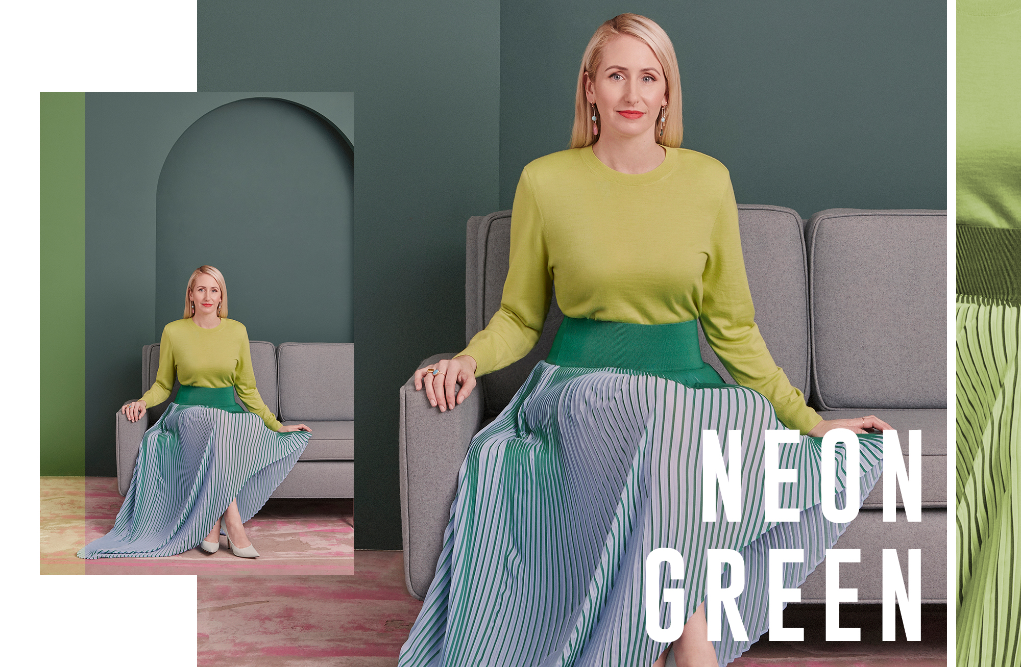
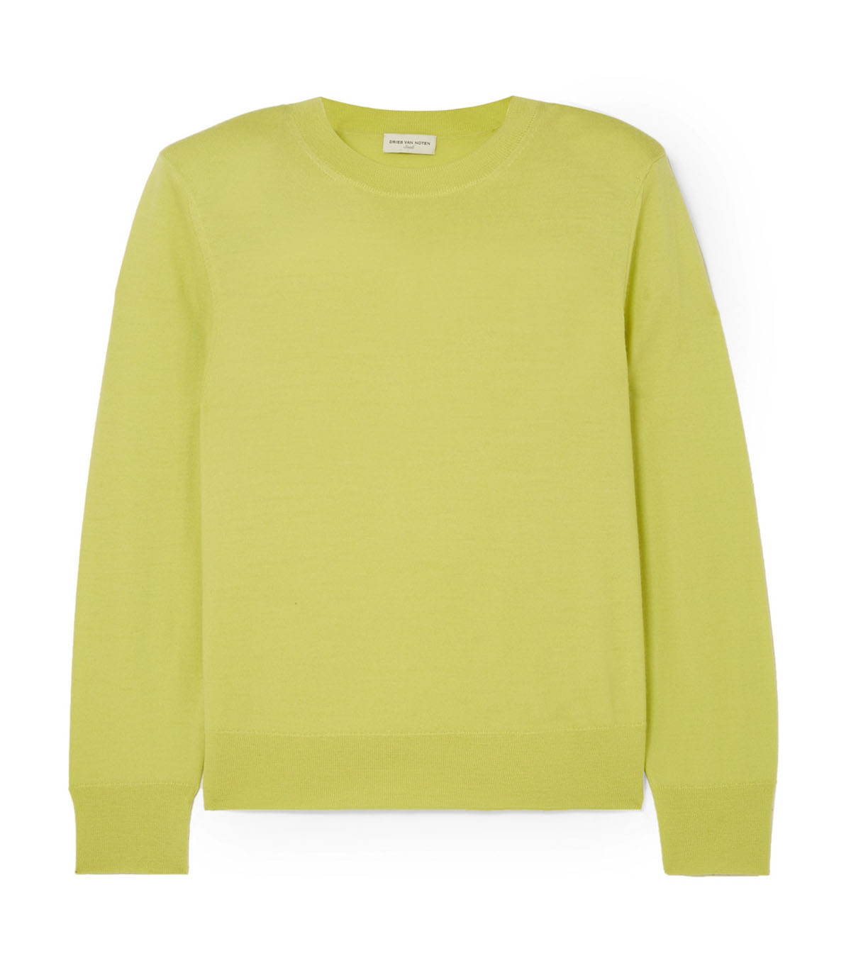
“I agree fluorescent green is a little bit scary, so I suggest just leaning right into it and getting a little monochromatic and tonal,” says Cloud, smiling as she delivers the line. Lime, slime green, neon—whatever you call it, the electric shade of yellow-green is nearly inescapable at the moment, and according to Cloud, the key to pulling it off defies all common logic. Her approach? “I think [not holding back with color] shows that you’re confident about your decision,” she notes. “That’s another thing about color: It gives you confidence when you wear it.”
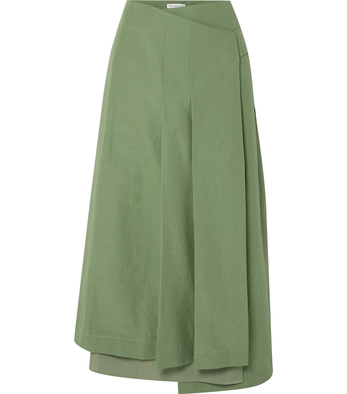
I can’t say that my first thought would be to pair fluorescent green alongside similarly saturated colors like the kelly-green skirt and mint heels Cloud chose, but combined in her outfit, it just works. Somehow, the volume of her green sweater that seemed to be yelling at a high octave on its hanger is brought down to natural speaking levels when styled tonally with the blues and greens that frame it on a color wheel. “That’s why I went tonal with that one,” she explained. “Because even if it reads as a certain color on its own, when paired with something else, it translates differently.”
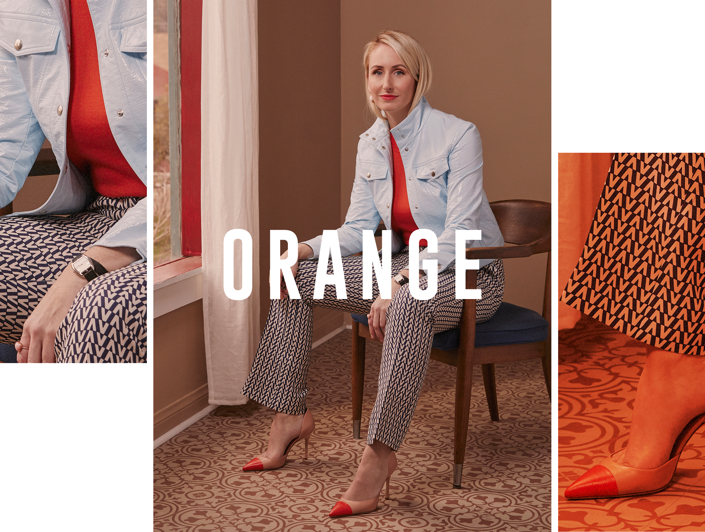
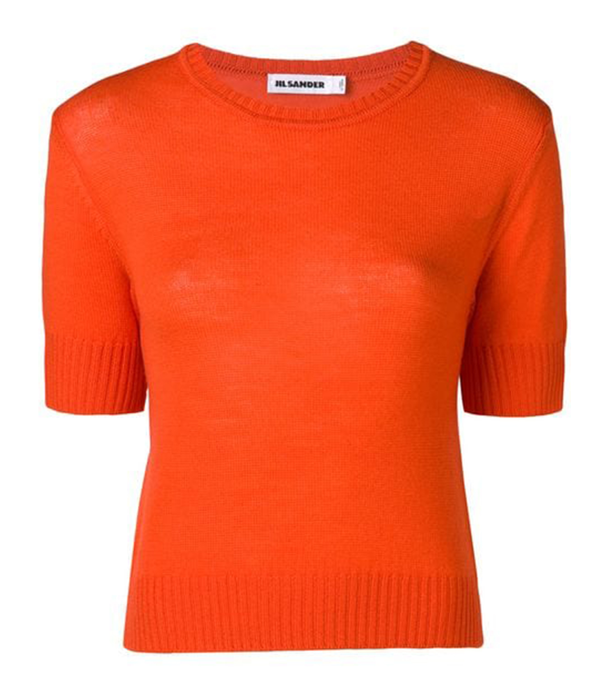
Fluorescent green I could understand on a trend level, but I’ve written more words than I care to count on my opposition to orange. In fact, orange personally offends me. So you can imagine my surprise and delight at how Cloud tackled it. Even more surprising was her notably sunny opinion on the color I normally find so offensive: “A lot of people don’t think they can wear orange, but actually anyone can. It’s so flattering on the skin no matter what shade you are.”
If you’re skeptical like I was, she recommends taking into account differences in warm and cool undertones when choosing the right shade of orange for you. But on the whole, a true orange, like the top she chose for this look, is, in fact, universal. If there was still doubt left in my mind on the color, witnessing the expert combination Cloud composed in this second outfit dispelled what remained.
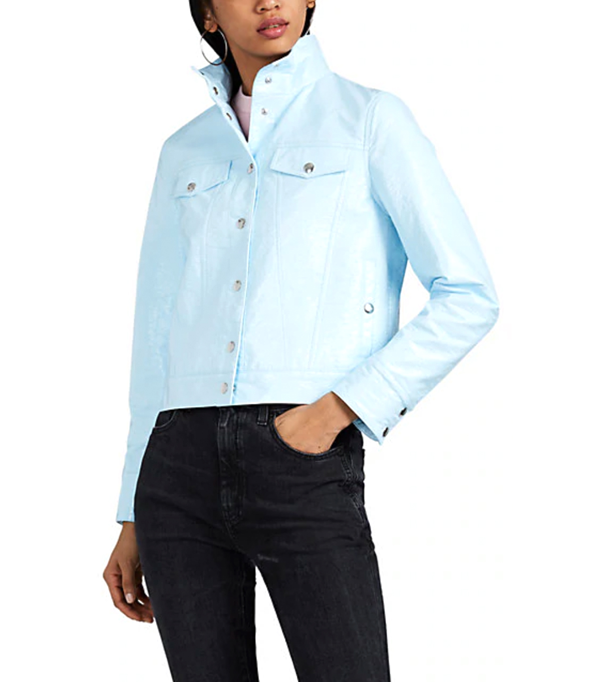
“The baby blue and orange seem unusual together because they’re both kind of bright colors,” she explained. “But I think they play off of each other really well and [the blue] has the effect of neutralizing the orange, but in a way that seems like they’re meant to be together—a happy little marriage.”
It's in these unusual combinations that Cloud really shines. She has an almost encyclopedic knowledge of how the color wheel works and uses it to her advantage to create compelling, albeit unlikely, pairings. “I think that a lot of times, if you have just one color on its own, it’s really pretty and it’s striking, but once you combine it with another color, it takes it to a different level. This is especially true with colors that are unusual or that you wouldn’t think are normally paired.”
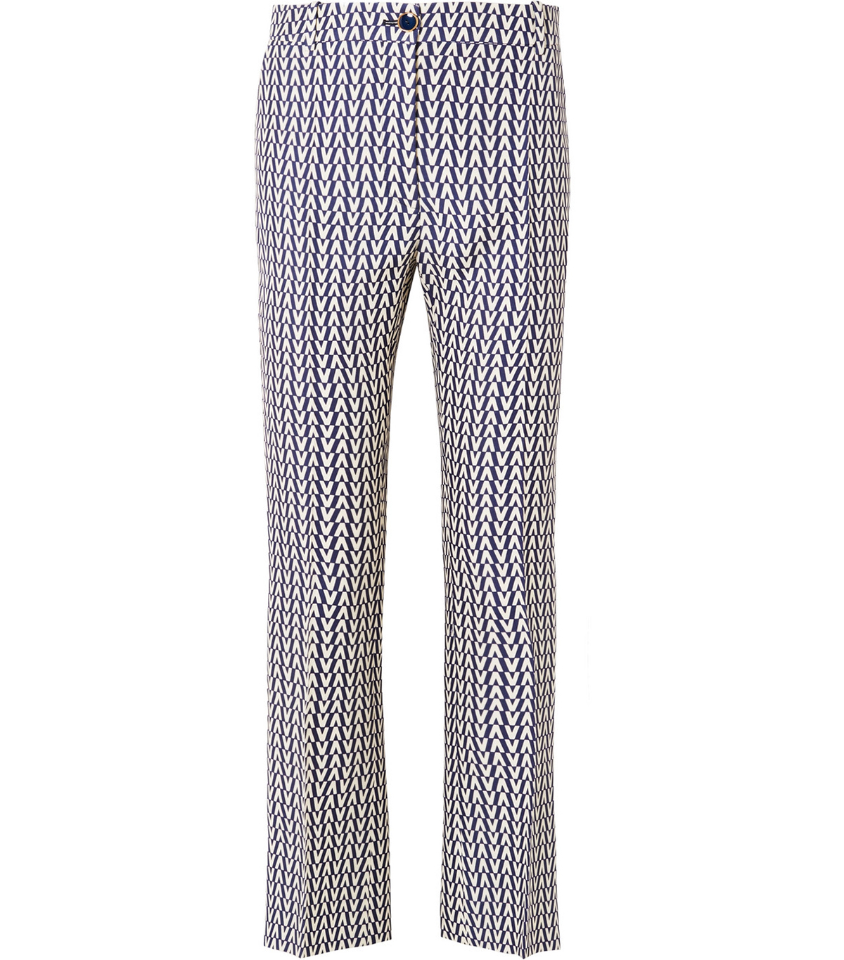
But throwing on a baby-blue jacket over an orange top wasn’t a random choice on Cloud’s part. Instead, it boils down to something she calls her “rule of three.” She explained, “It’s having a bright color, then an almost pastel or lighter color, and then finally, a neutral—that’s usually how my rule works.” My brain raced ahead before she could explain further. Orange is the bright here, baby blue would be the pastel, and the navy printed pants were the… neutral? “That’s what I think people don’t realize, that a print can actually serve as a neutral, which sounds crazy because you might think it would be too much, but it cuts the [original bright color].”
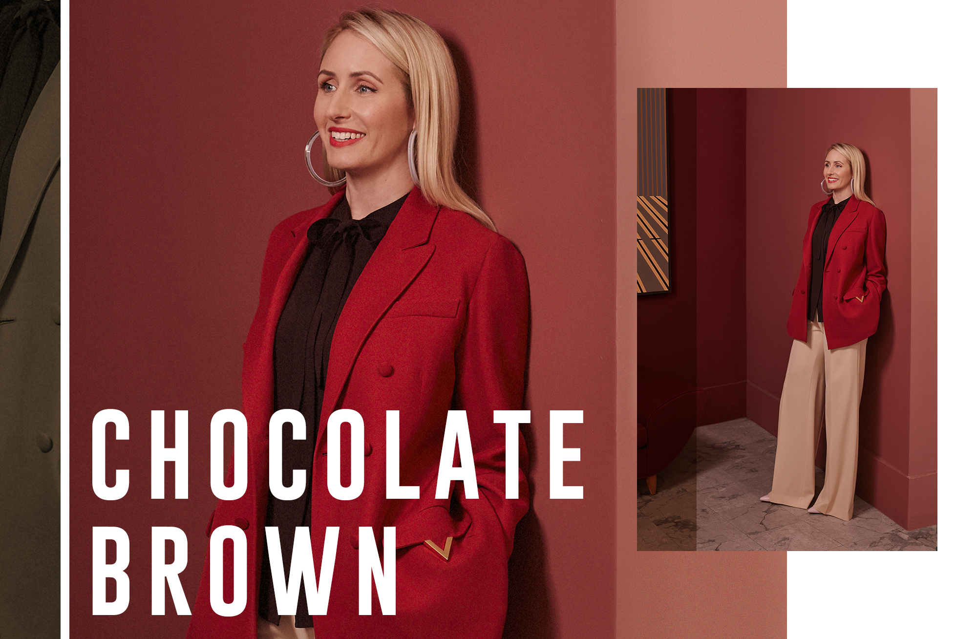
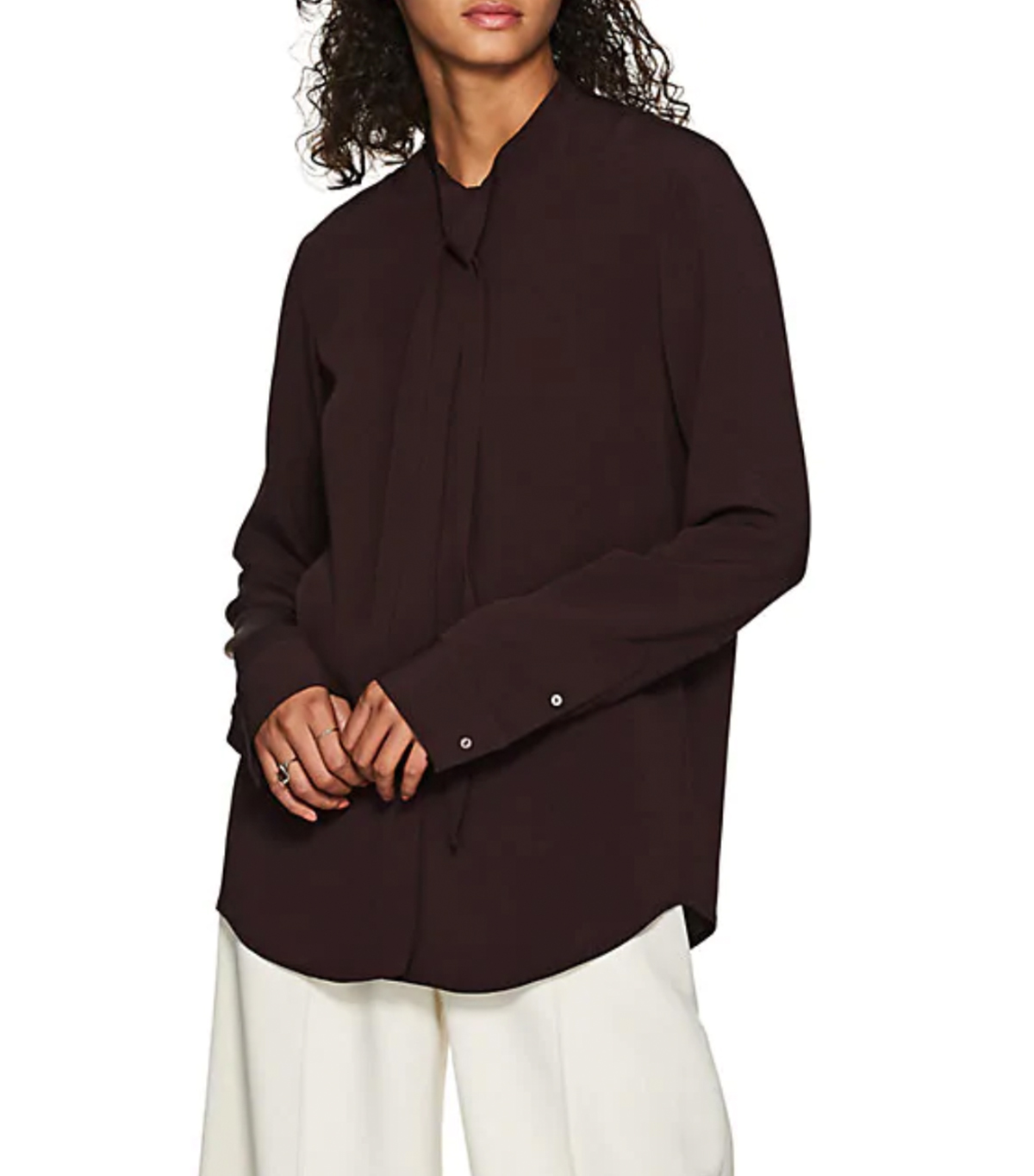
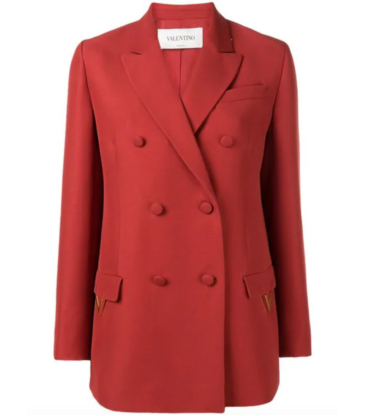
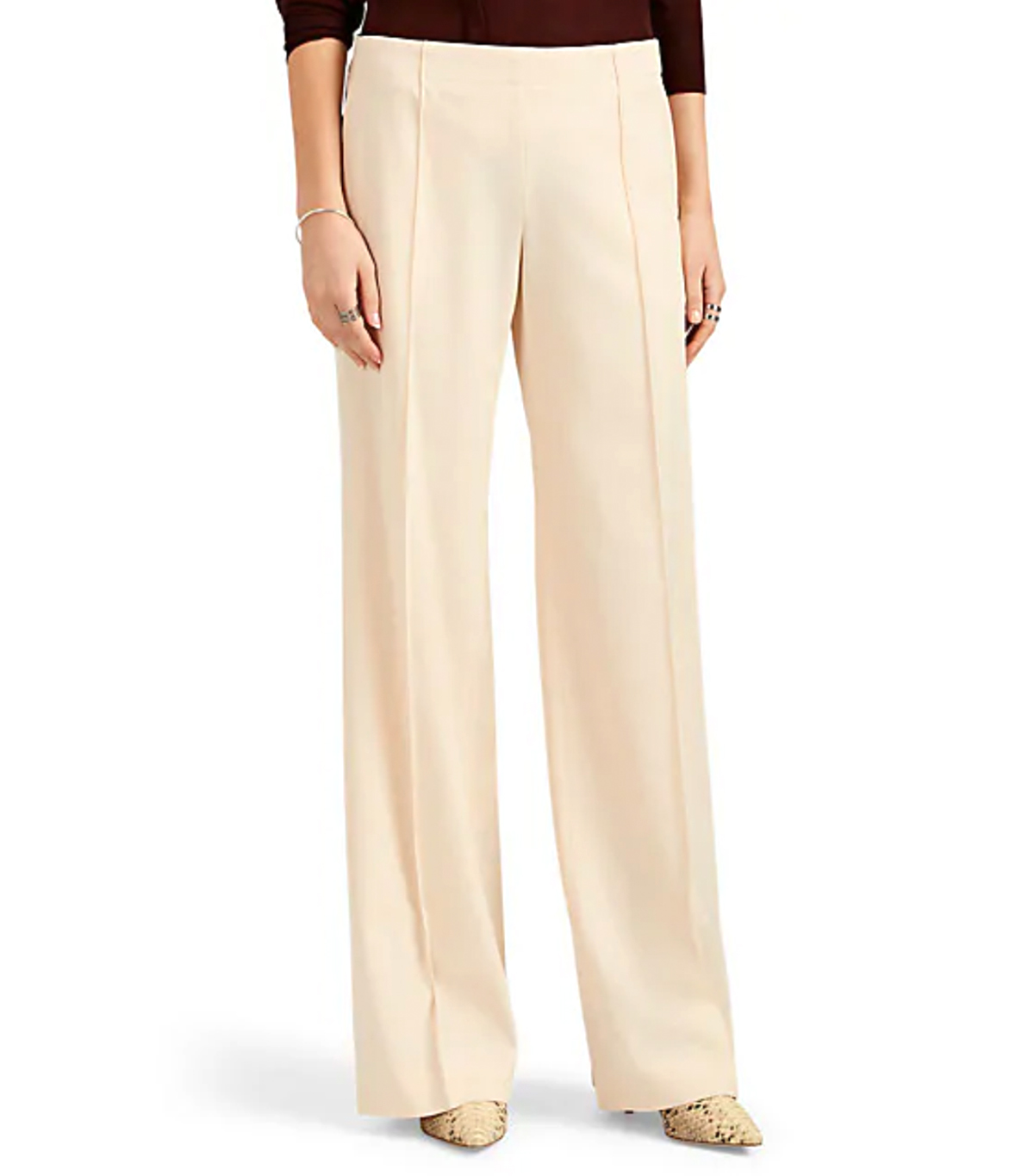
“Chocolate brown is such a luxurious shade," she admitted. “I wanted something that was luxurious because I think it can go a little muddy otherwise.” That reasoning led her to choose this blouse from The Row, which she thoughtfully paired with colors in the same family: cream trousers that lifted the heaviness of the brown and a burnt-orange blazer. She admitted that most people would avoid putting an orangey-red with a brown, thinking it to be too much like a mood board for the month of November, “but that’s why you have to cut it with a neutral or a lighter color,” she advised.
Cloud makes it sounds easy enough, yet this rich shade of brown is still uncharted territory for the vast majority of people who dwell in the safety of balancing literally any color with black (ourselves included).
If black is your safety net, this next tip will be a shock to your system. “I wouldn’t pair any of these colors with black. The contrast of it is just not that exciting,” she stated plainly. “I would do either denim or a gray. I think gray is a great neutral that makes these colors—any colors—pop.” Once again, Cloud’s expert advice defies common sense. For a color as close to black as chocolate brown, this advice becomes even more potent. “I would try to treat it like an alternative to black. Any time you would normally choose a darker shade, maybe try and do a chocolate brown there.”
Just as she’s about to step in front of the camera, Cloud shares a seemingly mundane anecdote that’s actually quite telling. She pulled out her phone and showed me photos from a Crayola-themed party she hosted on her most recent birthday where all her guests were tasked with wearing a single color of their choosing (just no white or black) from head to toe. “Most people have a tendency to buy a certain color they really love,” she says knowingly, “so even though they’re scared of trying it, they’re already subconsciously doing it.” For someone who’s built an entire career on her ability to pair and combine clothing in a way few others can, Cloud certainly has a habit of doling out her expert advice freely.

Anna is an NYC-based senior fashion editor who has been a member of the Who What Wear team for over eight years, having begun her career in L.A. at brands like Michael Kors and A.L.C. As an editor, she has earned a reputation for her coverage of breaking trends, emerging brands, luxury shopping curations, fashion features, and more. Anna has penned a number Who What Wear cover interviews, including Megan Fox, Julia Garner, and Lilly Collins. She also leads the site’s emerging travel vertical that highlights all things travel and lifestyle through a fashion-person lens.
