7 Colors to Buy If You're Over Quiet Luxury But Still Want to Look Rich
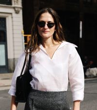

"Quiet luxury" might be a new phrase, but the silhouettes, colors, and brands that encompass it are far from novel. In fact, I've been dressing in a way that would now be considered quiet luxury—think minimal pieces with soft, neutral hues, high-quality fabrics, and elegant cuts—for much of my adult life. Now that it's a huge fad, though, my affinity for the aesthetic has begun to wane slightly. It feels too *everywhere* in a way that's starting to turn me off. For the first time in close to a decade, I'm eyeing pieces of the louder (but still luxurious) variety.
To aid in my journey into the unknown world of maximalism, I put together a guide to the colors that I want to tackle first, ranging from slightly louder shades than the ones I'm used to like margarine and mossy green to full-on screaming hues such as gold, mint, and tangerine. Scroll through and shop them all if you, like me, are growing a touch tired of quiet-luxury mania and finding comfort in clothes, shoes, and accessories that yell rather than whisper.
Tangerine

As bright of a color as tangerine is, the shade can appear surprisingly low-key and relaxed without being too sleepy when styled with the right things. I love how it's mellowed out with white linen trousers and a quieter shade of burgundy here. At the same time, if you are a louder dresser, orange can just as easily be played up and styled with other bright colors like pink, blue, and green.

Shop the shade:


Mossy Green

Miuccia Prada loves to experiment with shades of green, but my favorite by far was the mossy green that she utilized for Prada's fall 2022 collection. The color is stunningly rich without having to be muted and looks good with truly everything.
Shop the shade:


Margarine

The craze around margarine-colored clothing items may have died down slightly since the early 2020s, but that doesn't mean that the color is any less chic. Now, it really only signifies that you'll be unique instead of one of many if you wear it. Of all the colors on this list, I'd say that this is the one that screams "Money!" the loudest.
Shop the shade:


Chili-Pepper Red

Red is everywhere right now—period. From the runways to Instagram and beyond, the vibrant shade that's long been thought of as more daring than wearable is finally becoming a staple part of people's wardrobes. Style it with other loud colors like green and yellow or with rich shades of brown, cream, and gray. Hell, go full monochrome with an all-red outfit. The possibilities are endless.
Shop the shade:


Chrome

Metallics have been commonplace on the runways for the last two seasons, with silver really dominating in the apparel, handbag, and shoe worlds. It's certainly not a mellow color, but it is quite easy to pair with muted items to make them pop. Really, one or two chrome pieces in your wardrobe that you can wear again and again in dozens of different ways will make all the difference if your quiet-luxury closet is starting to make you snooze.
Shop the shade:

Shop the matching Mesh Metallic-Thread Skirt ($46).


Cornflower Blue

This delicate shade of blue will always remind me of Princess Diana, one of the chicest, best dressed women, well, ever. Even if everything else you wear is simple or neutral, throwing on a cornflower-blue piece will make it showstopping and eternally elegant.
Shop the shade:


Gold

As much as I love muted colors, they don't exactly liven up an outfit when you need them most. A bright, golden shade of yellow, however, will make even the gloomiest of end-of-summer days feel like mid-July on a beach in the tropics.
Shop the shade:


